 "Slant6" (slant-6)
06/19/2016 at 00:27 • Filed to: None
 4
4
 6
6|
"Slant6" (slant-6)
06/19/2016 at 00:27 • Filed to: None | 4
| 6 |
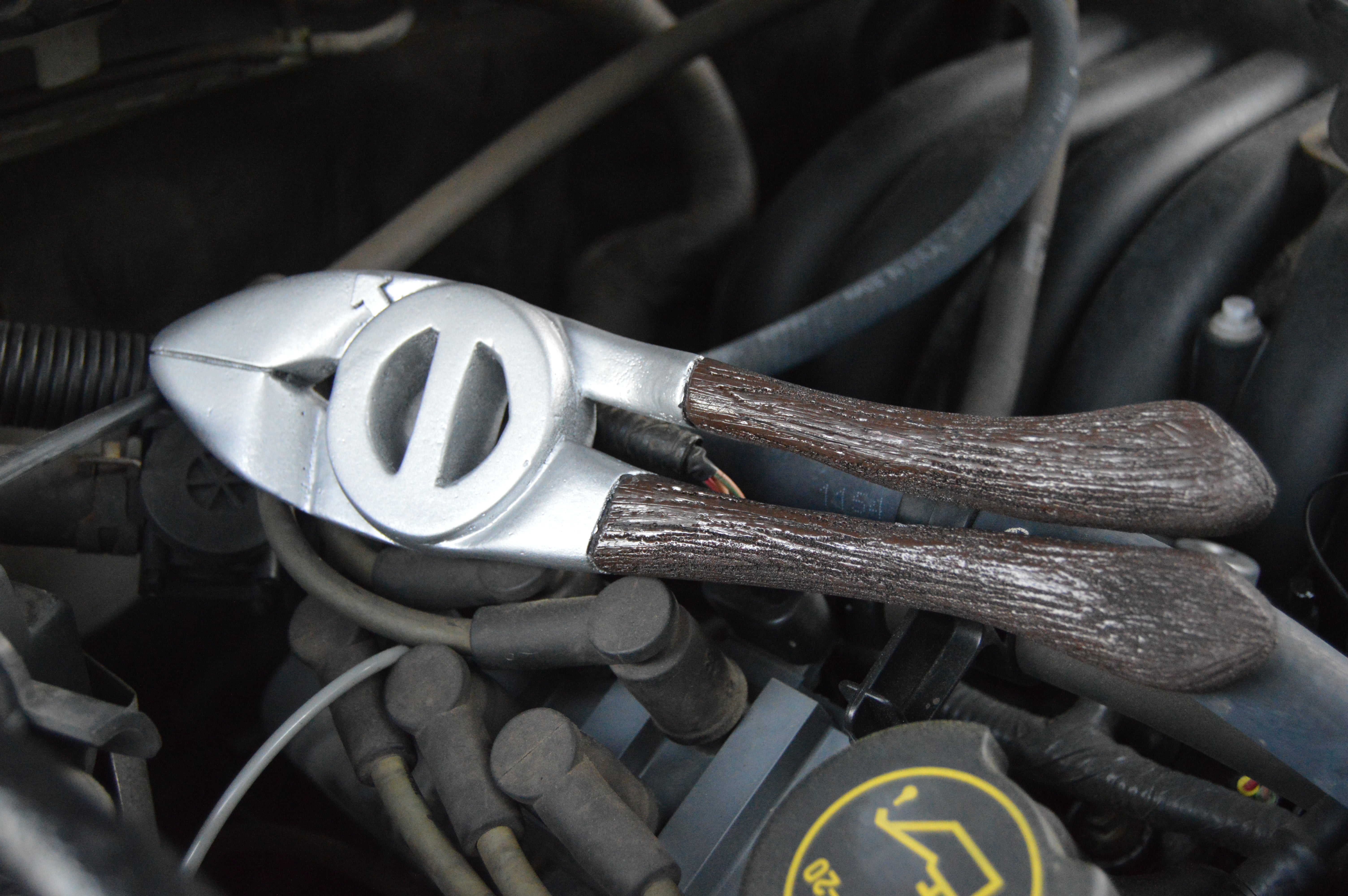
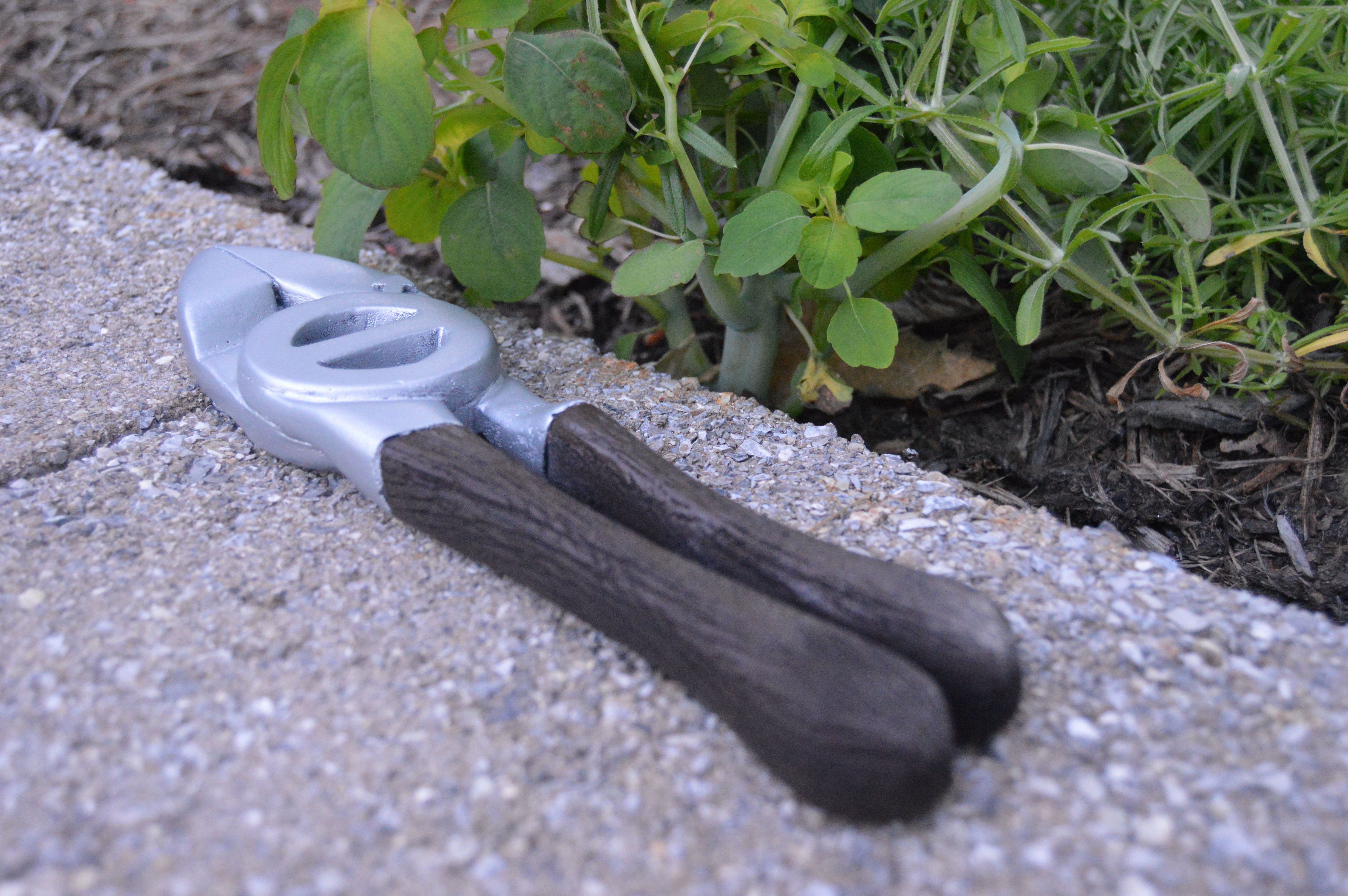

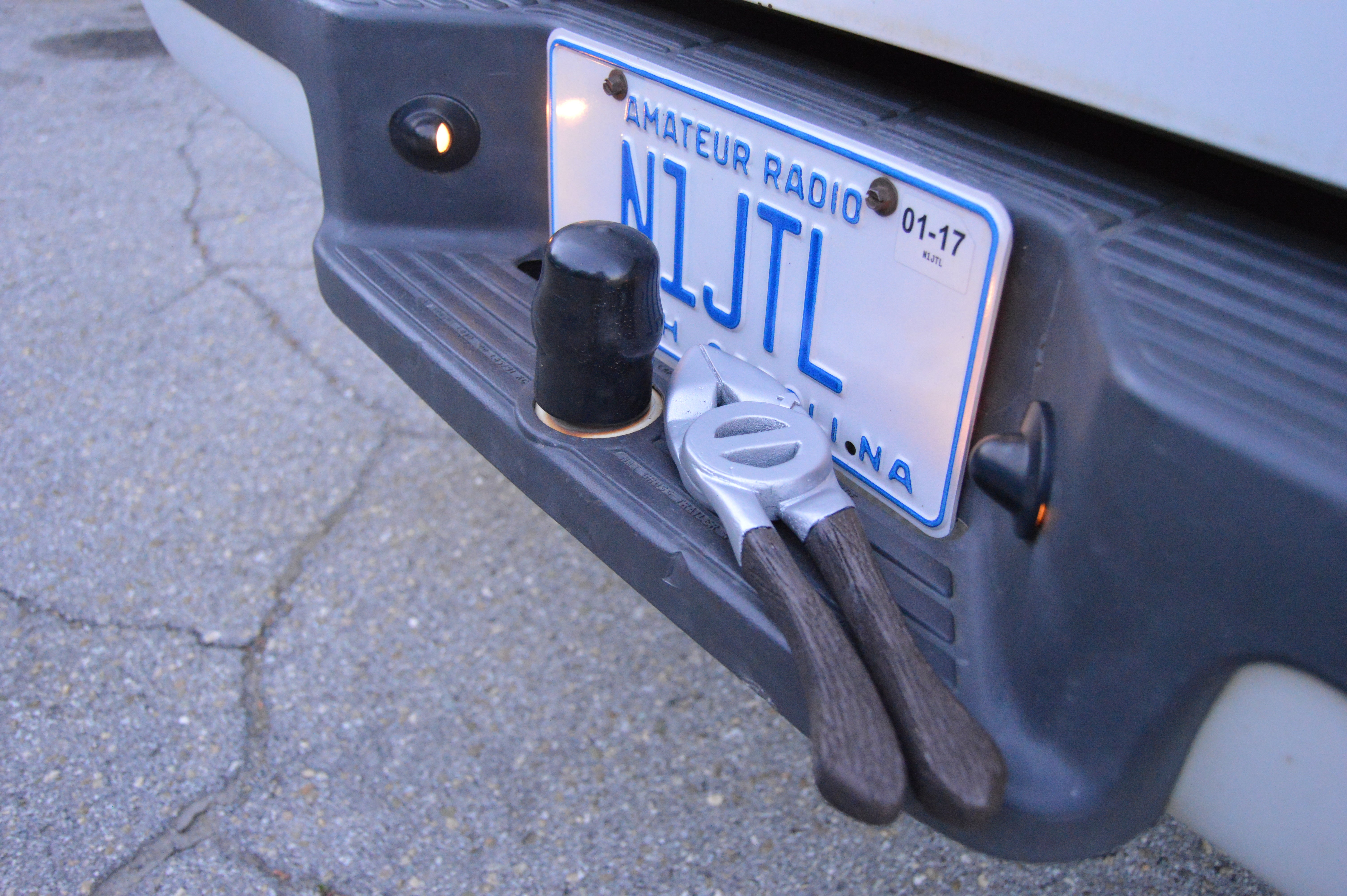
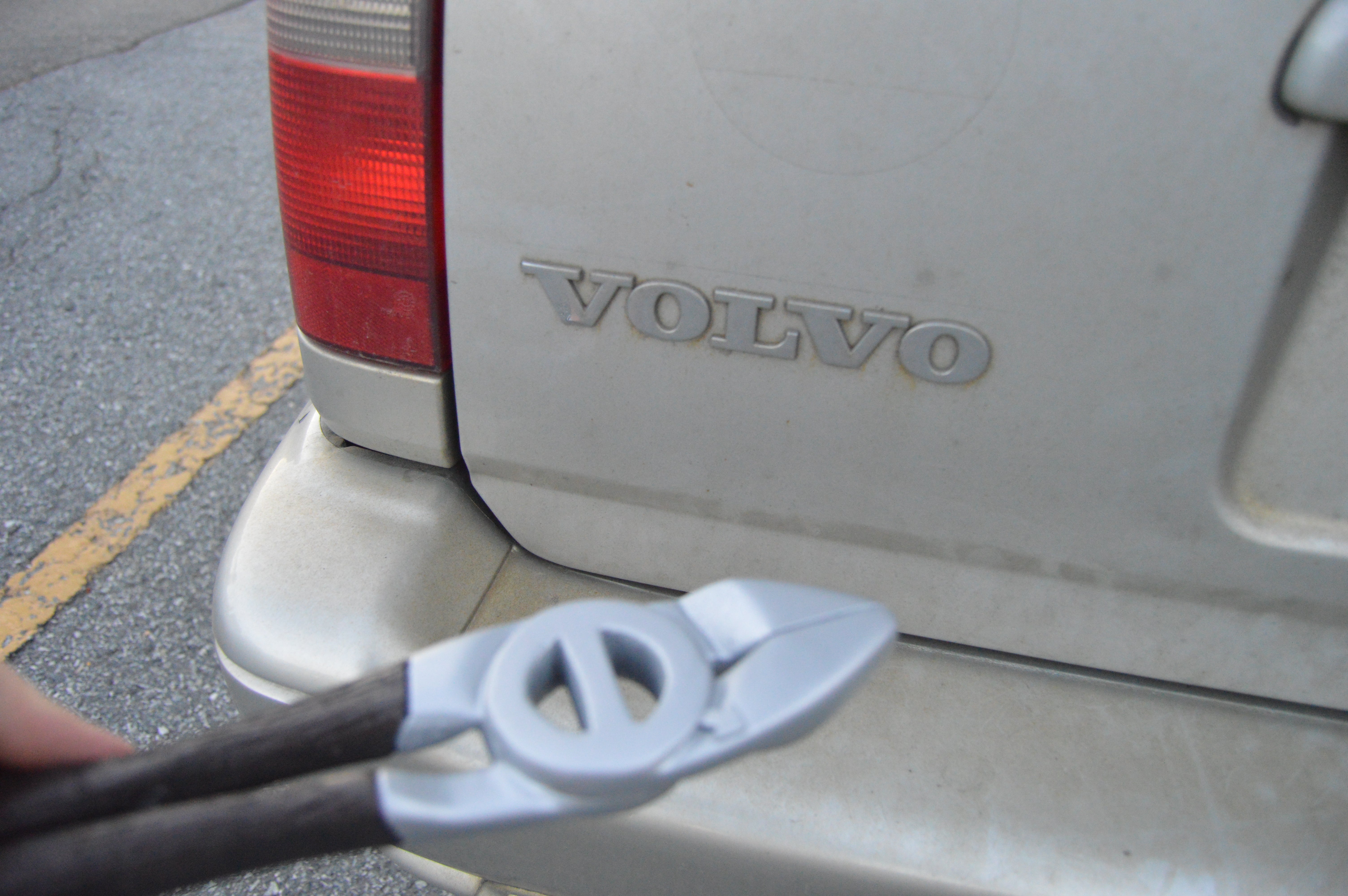


Any feedback or favorite photos? Here’s what my final page layout looks like now, also taking feedback on it. I already have some things in mind to change.
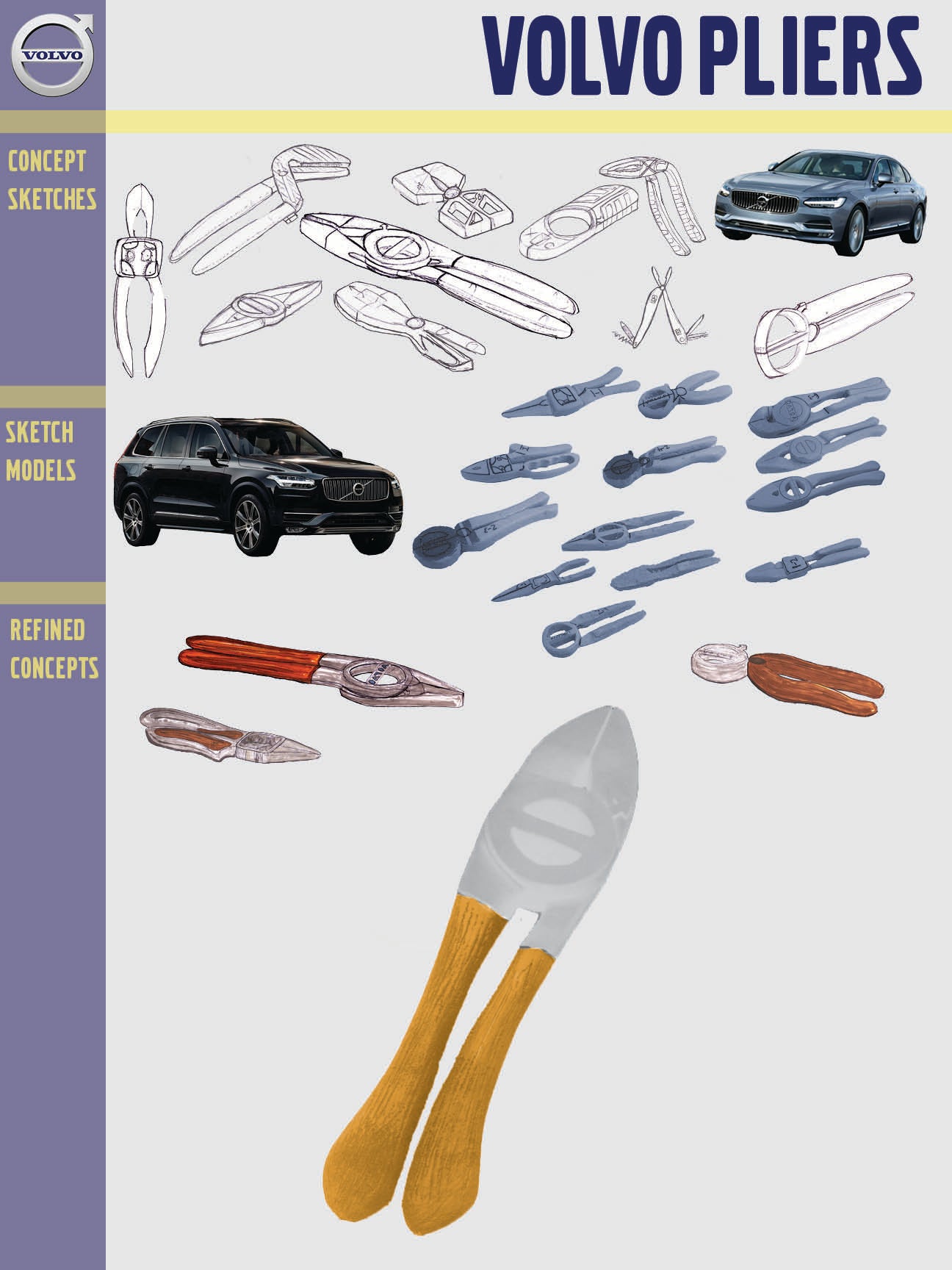
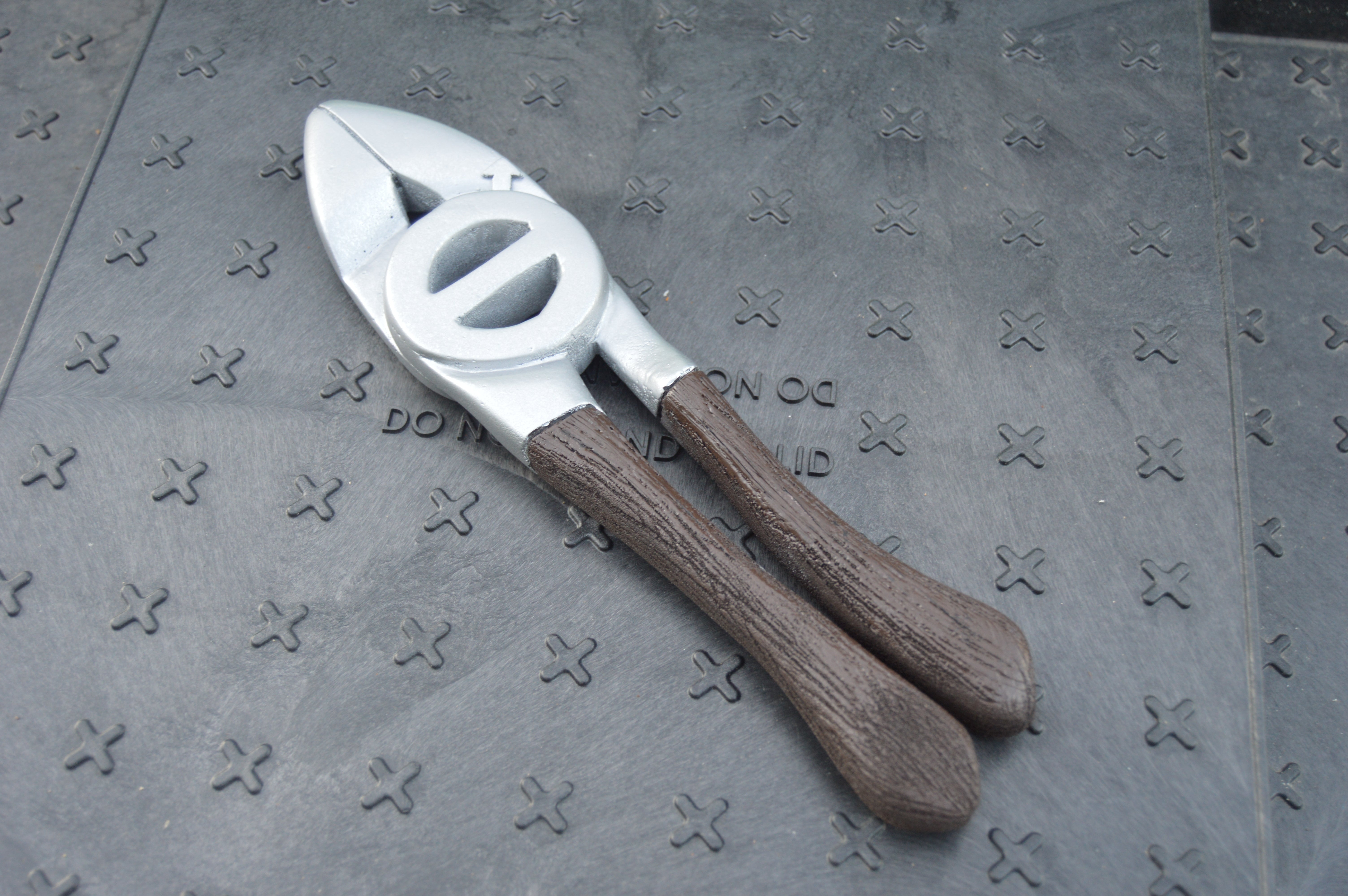
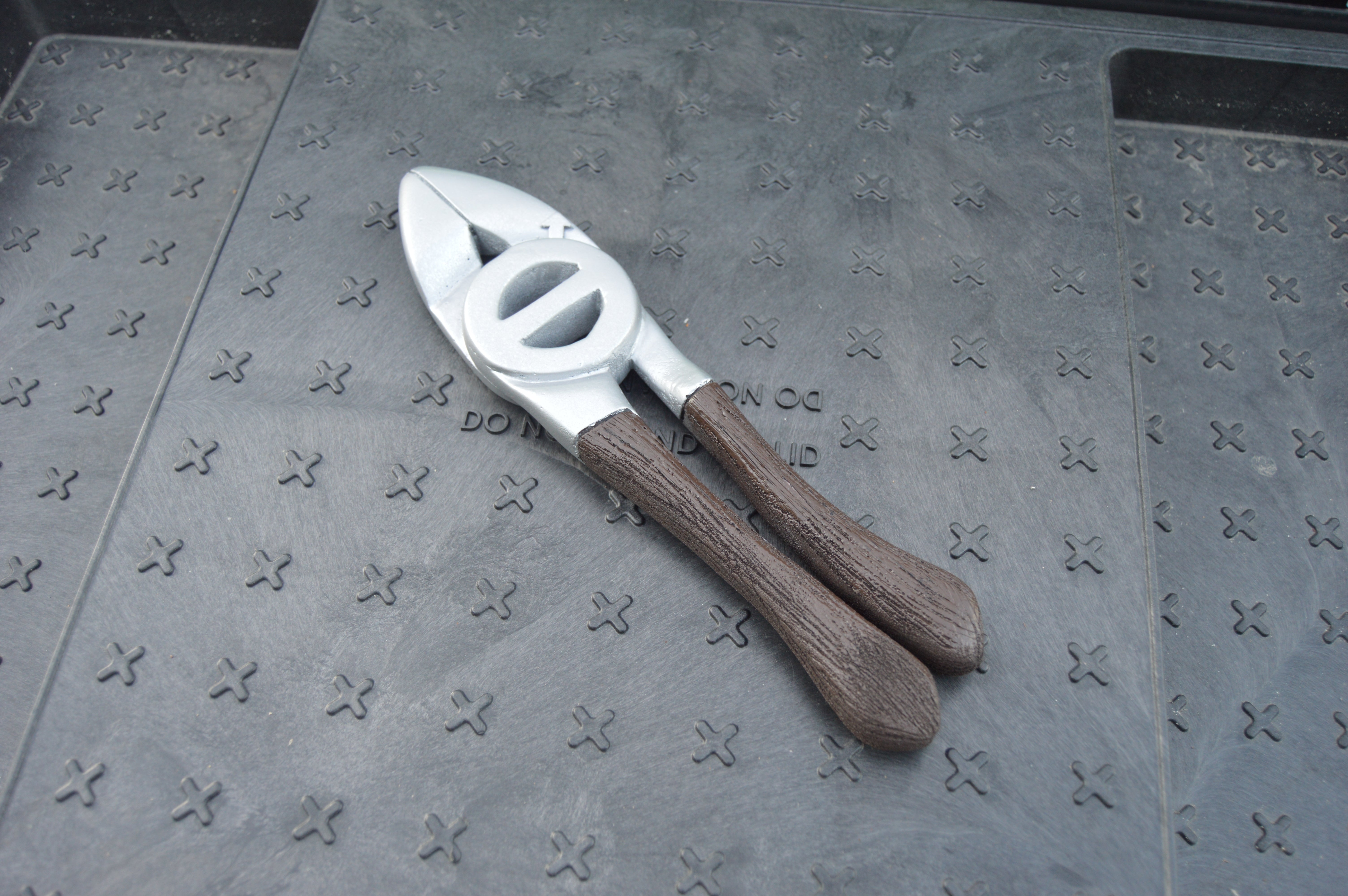
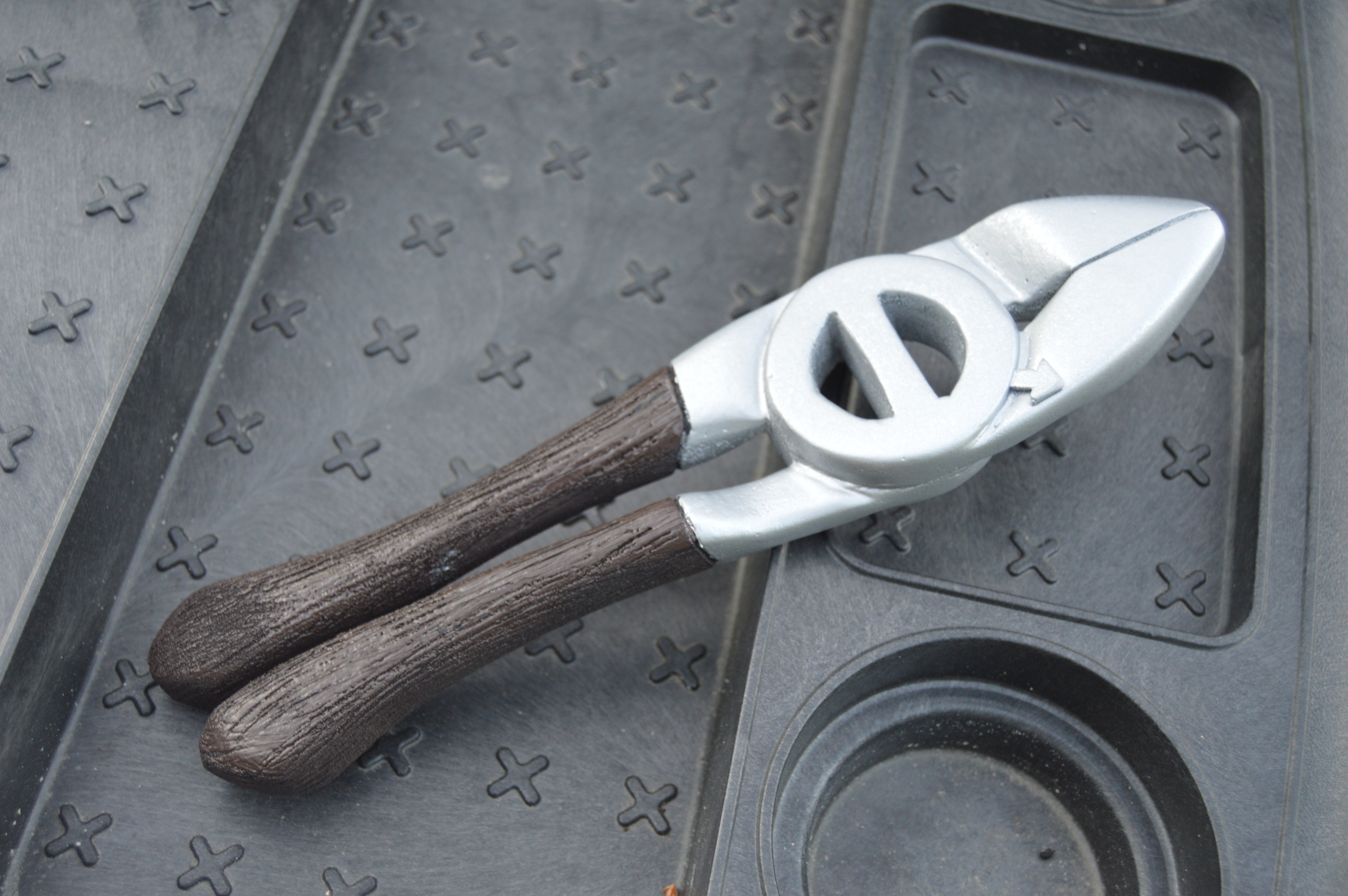
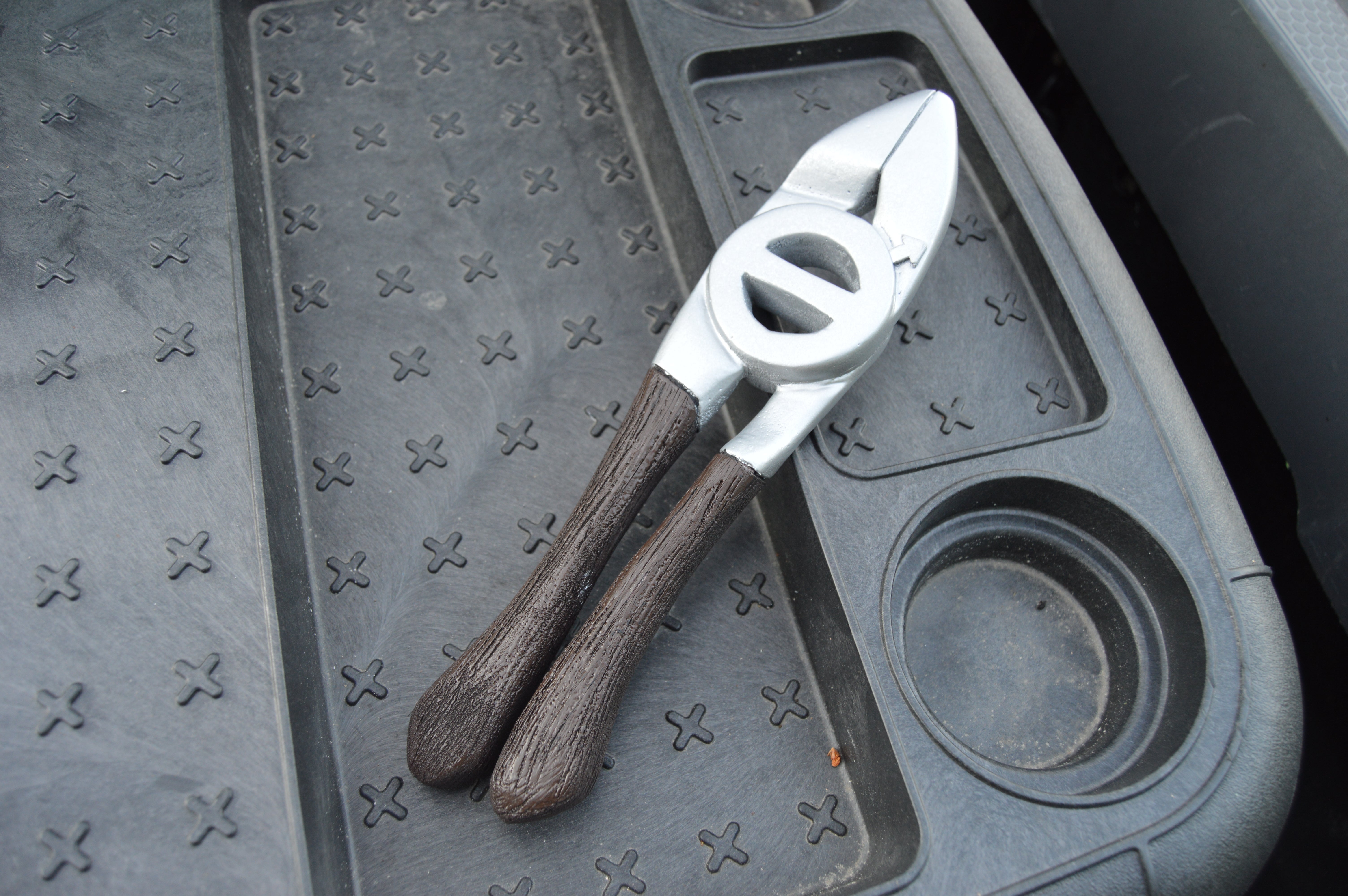
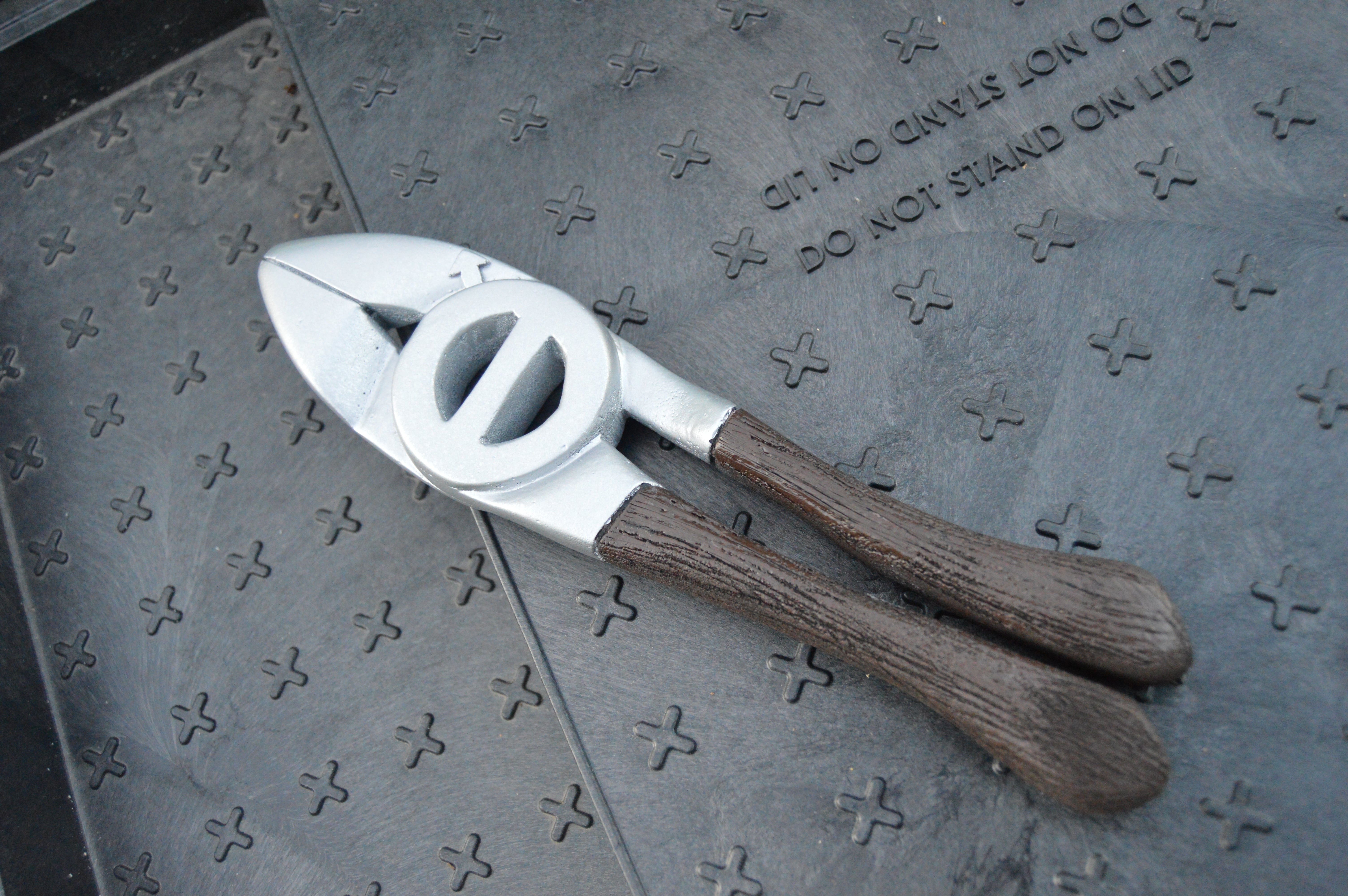
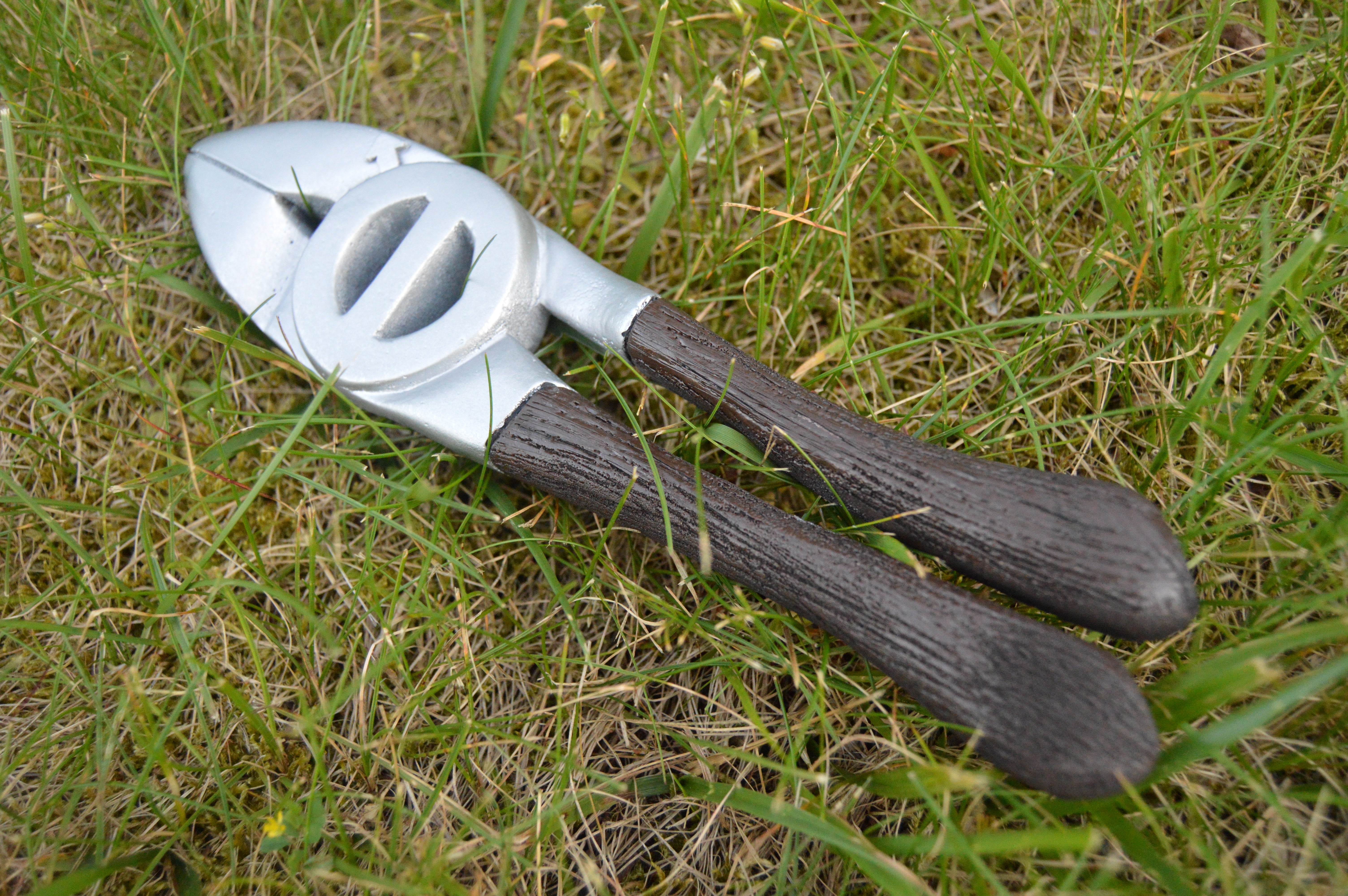
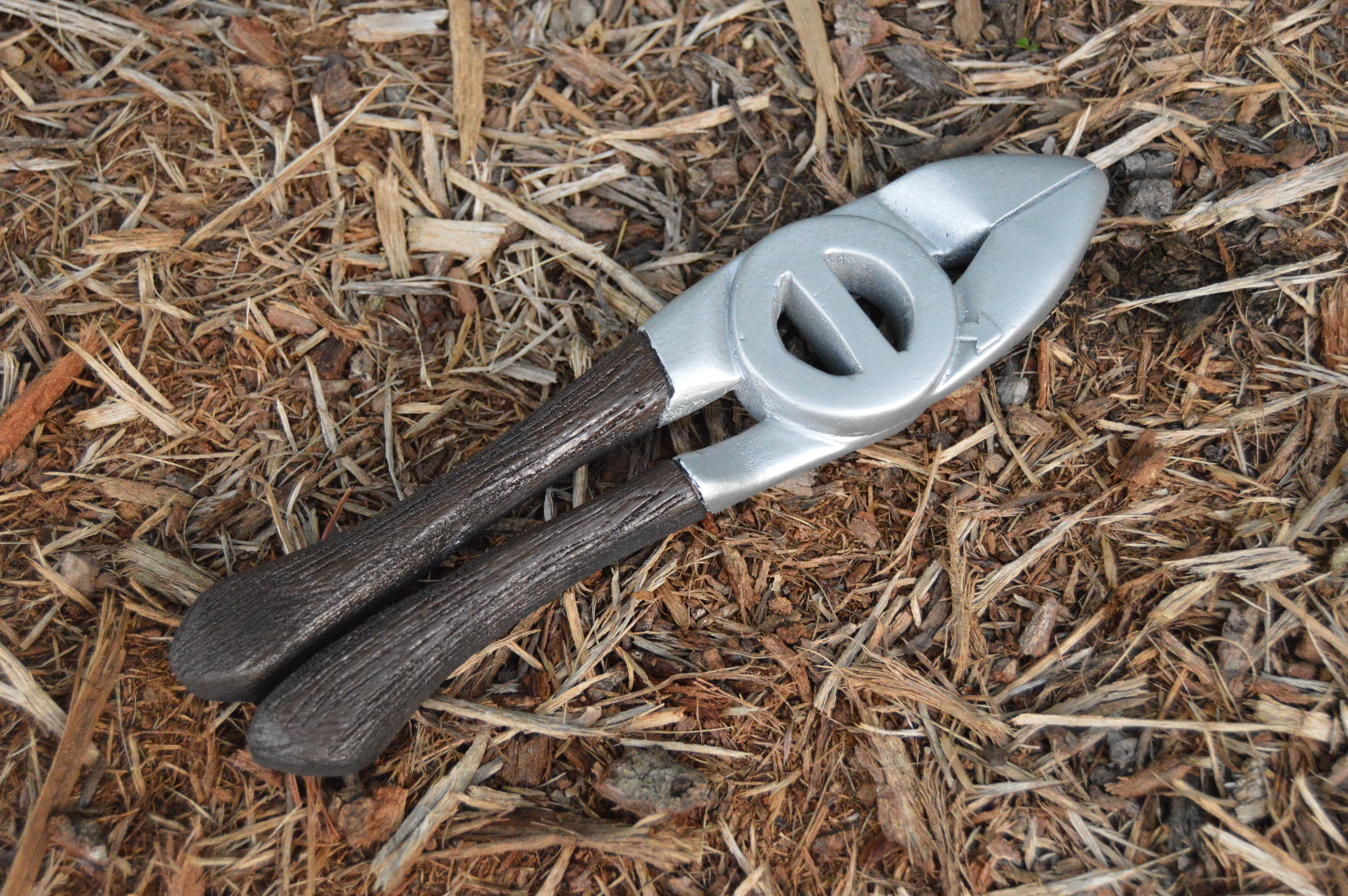
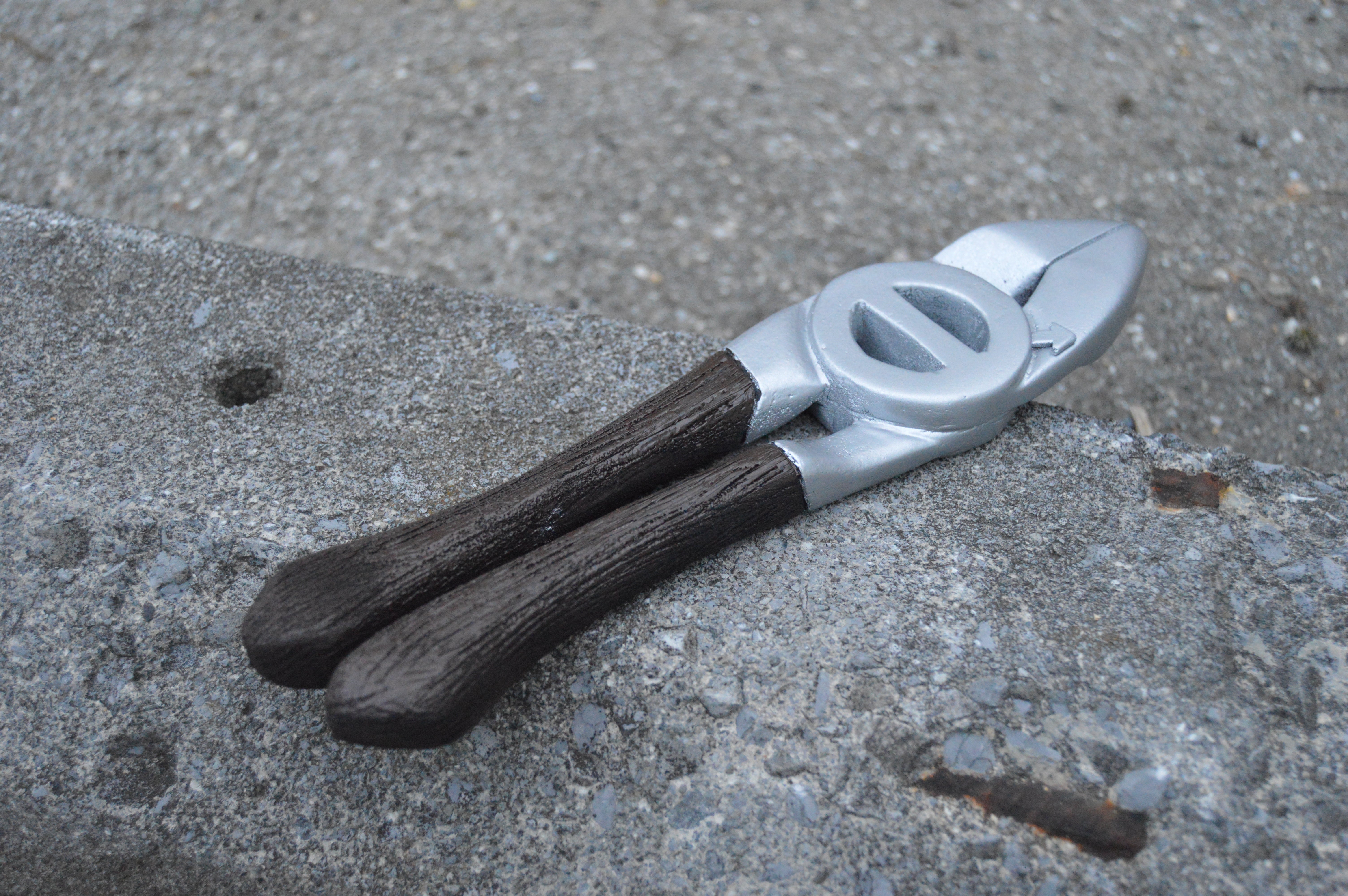
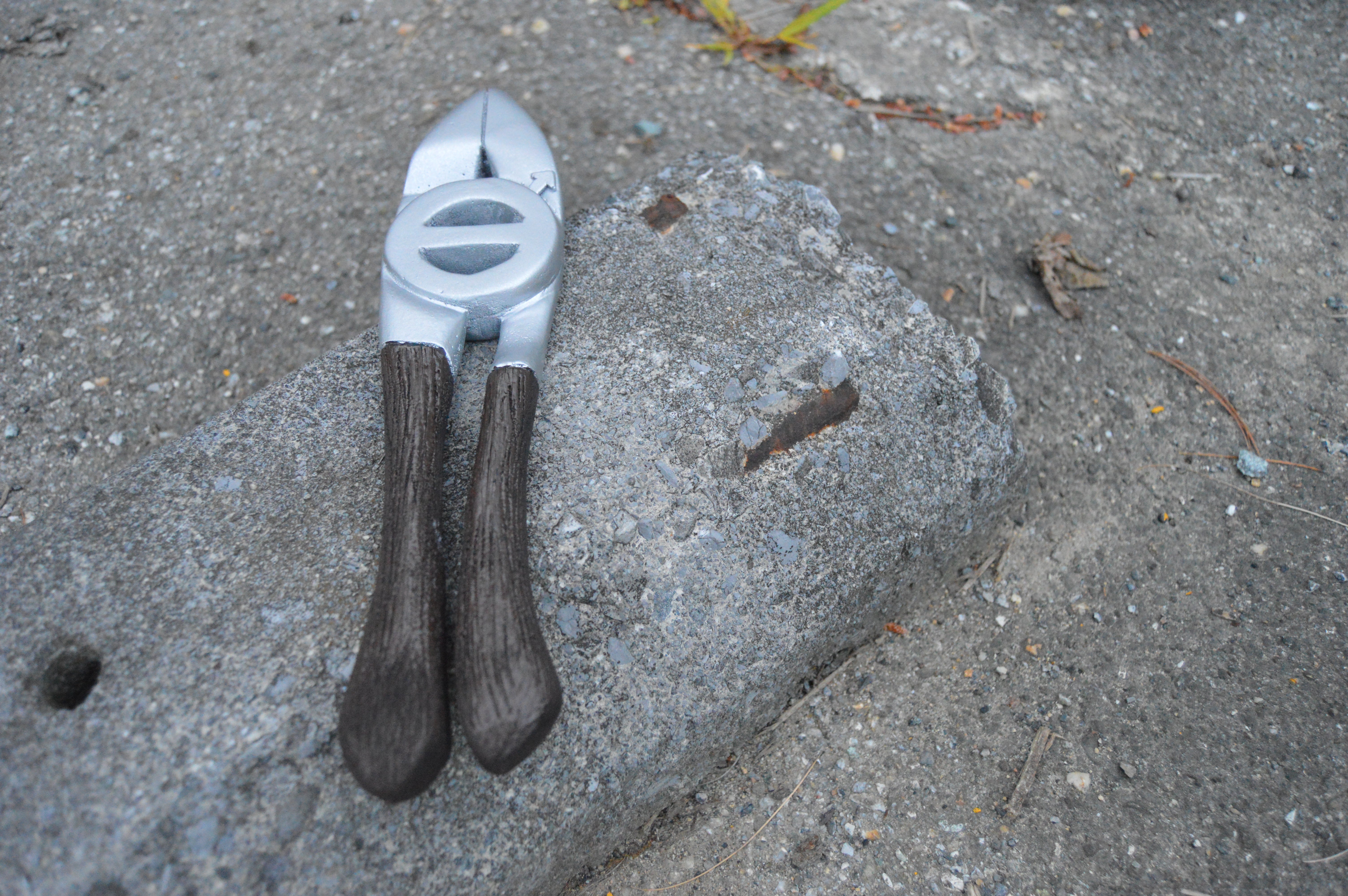
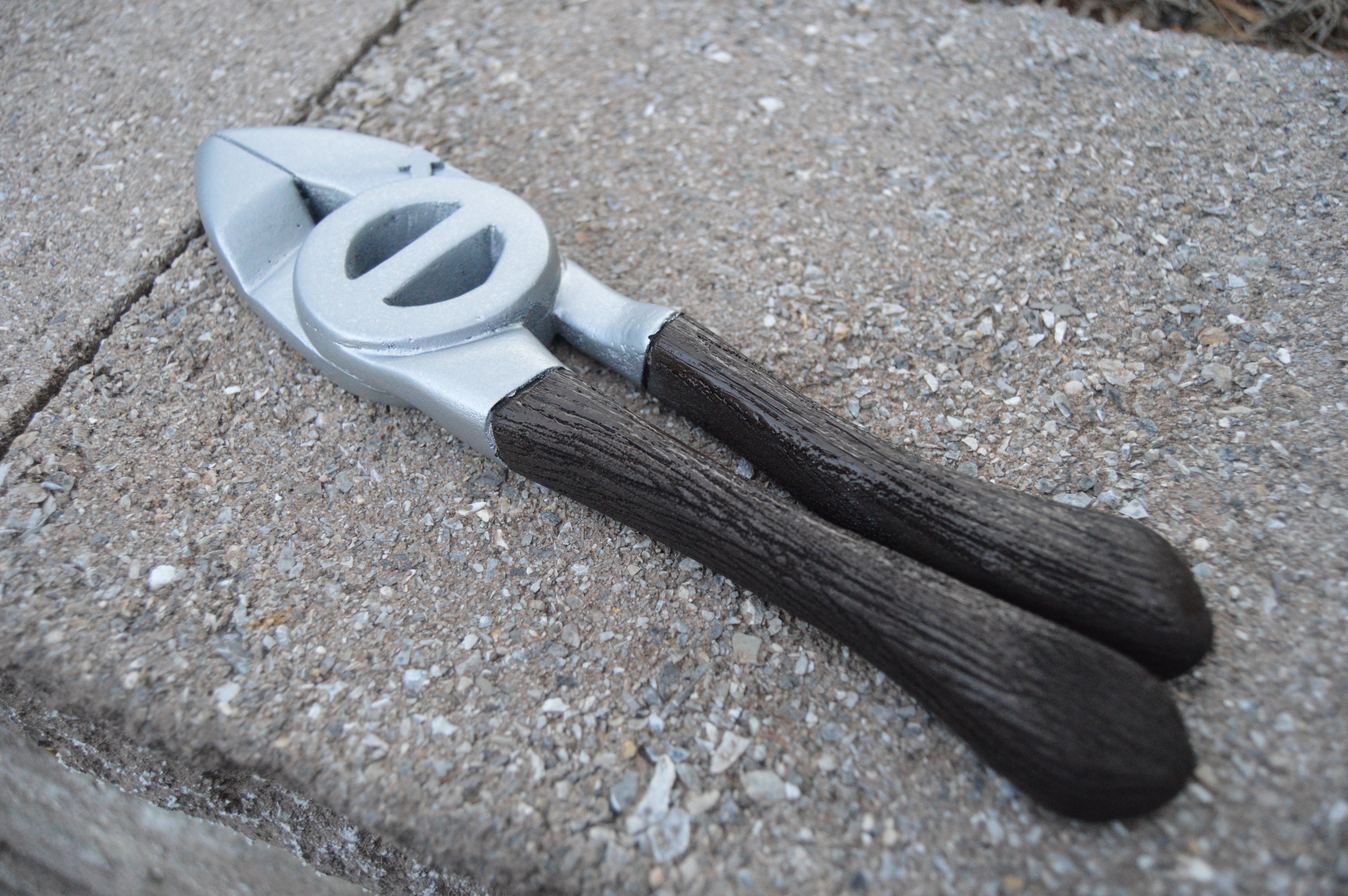
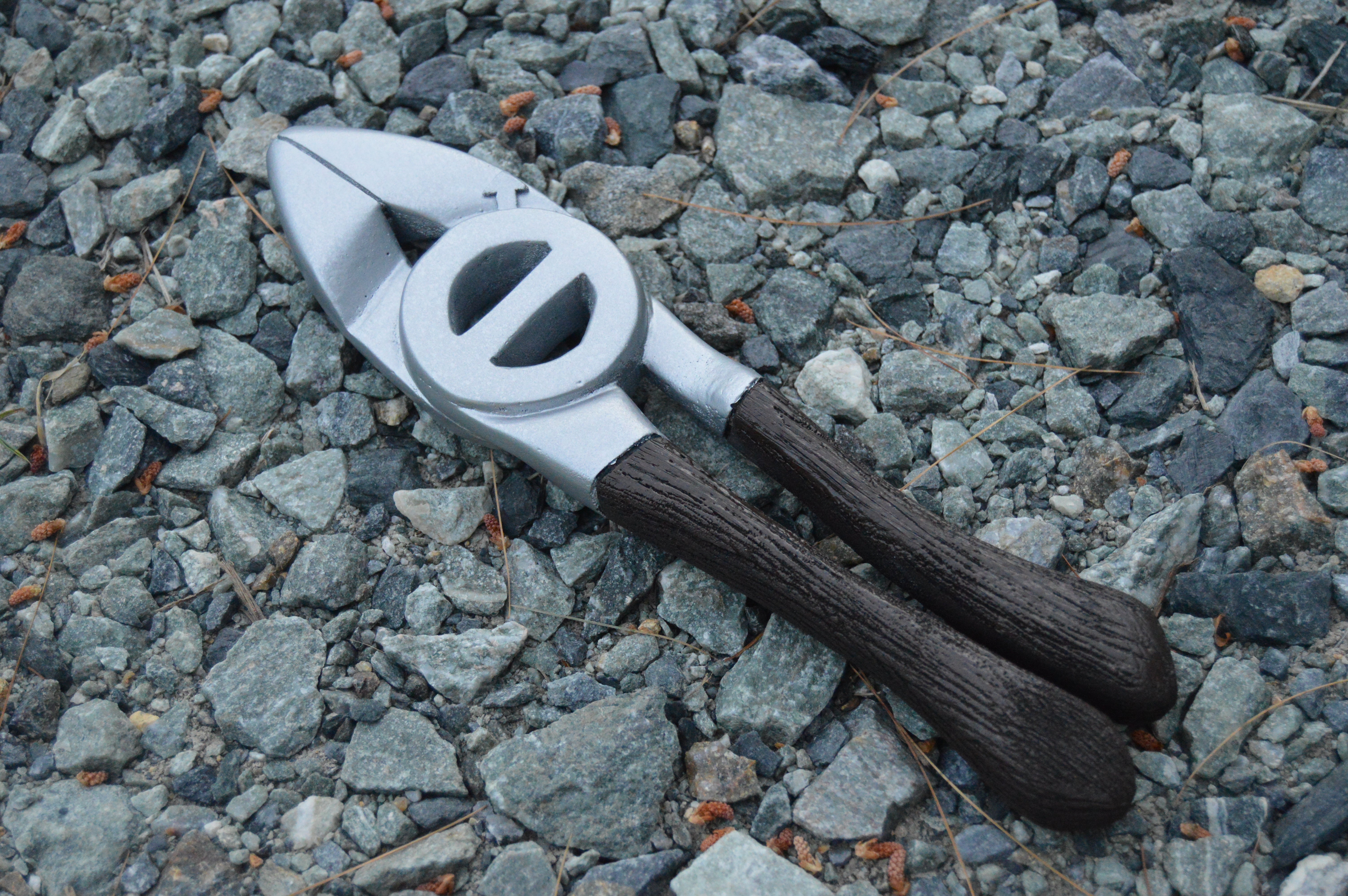
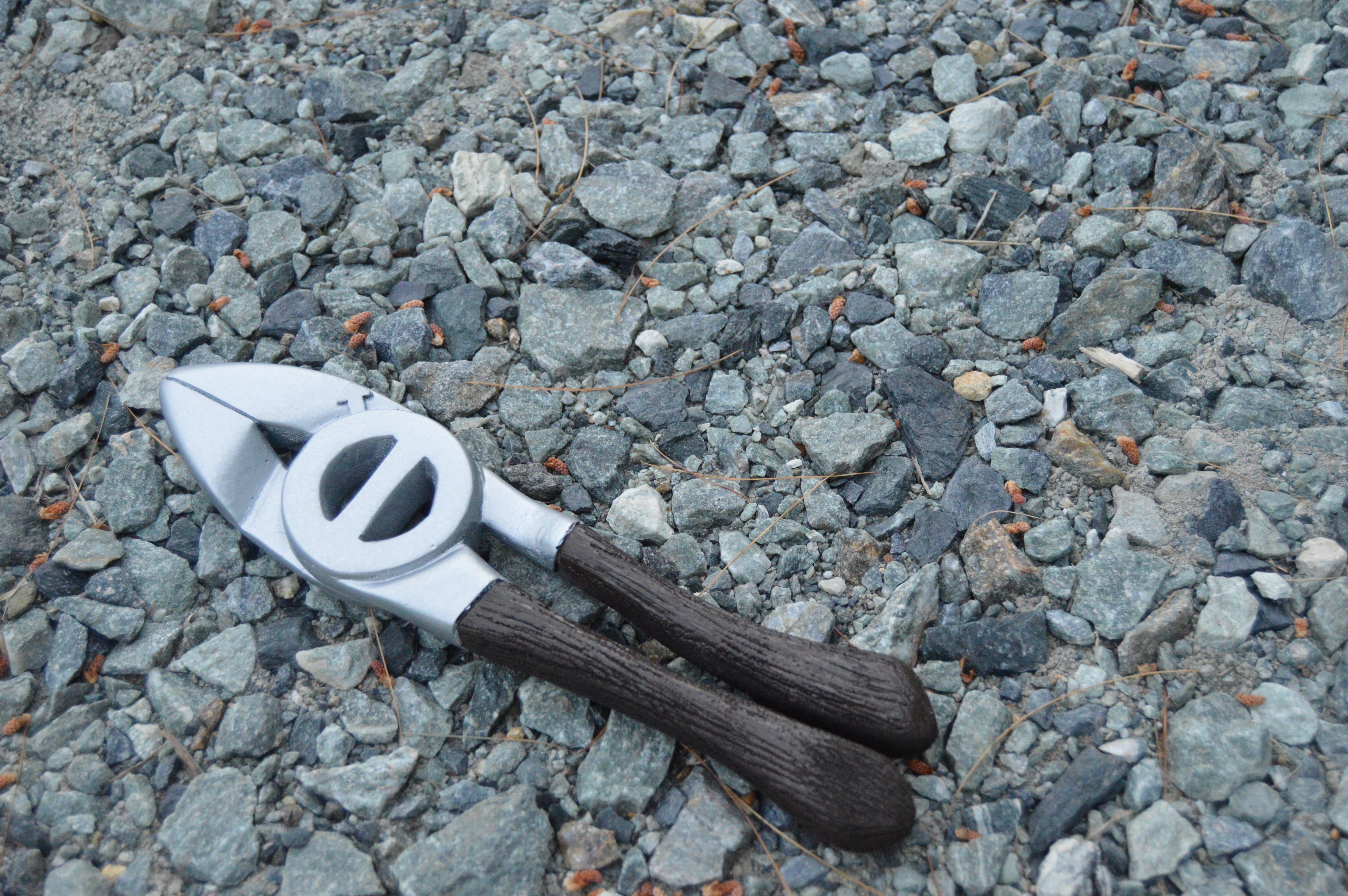
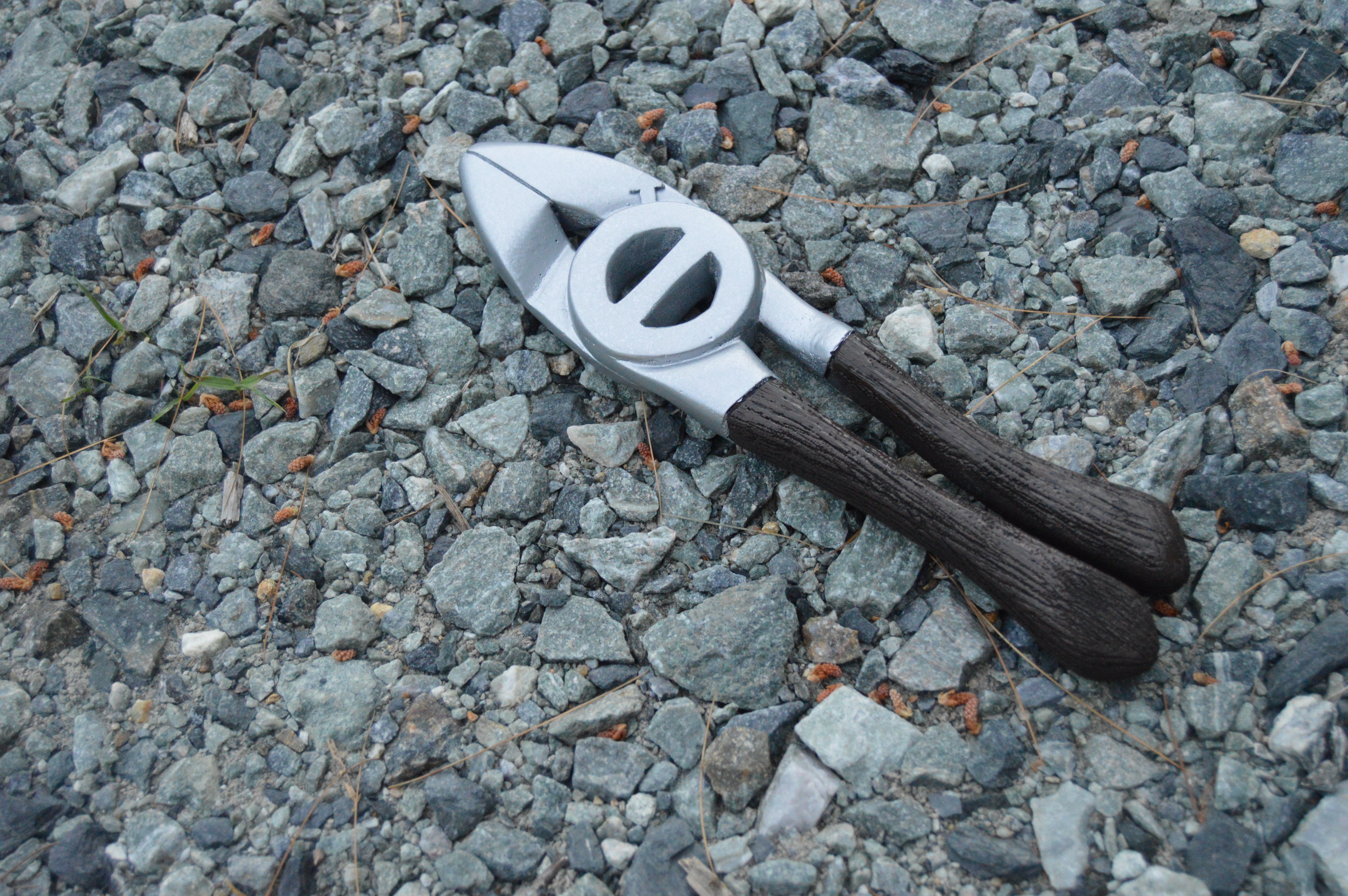
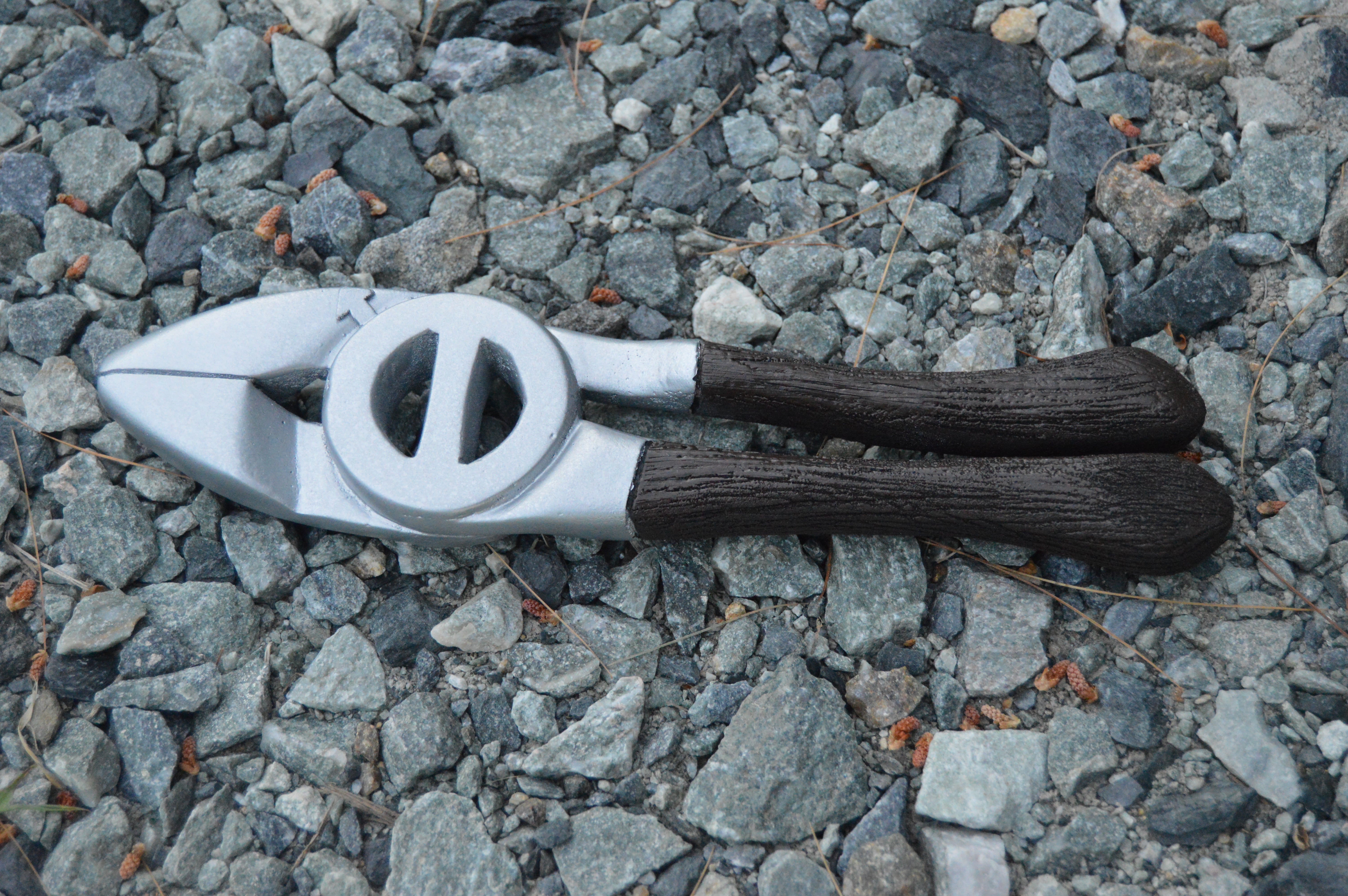
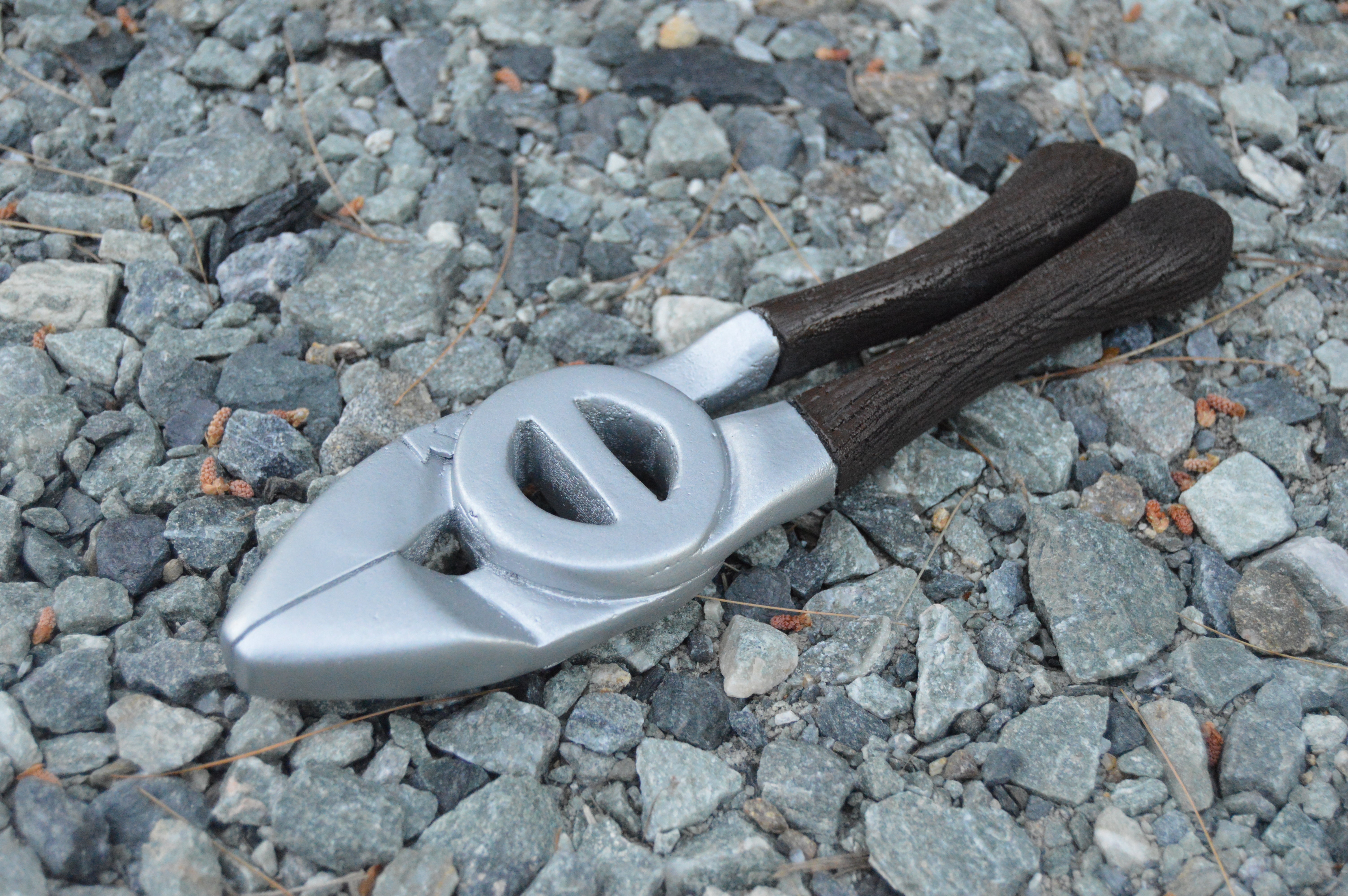
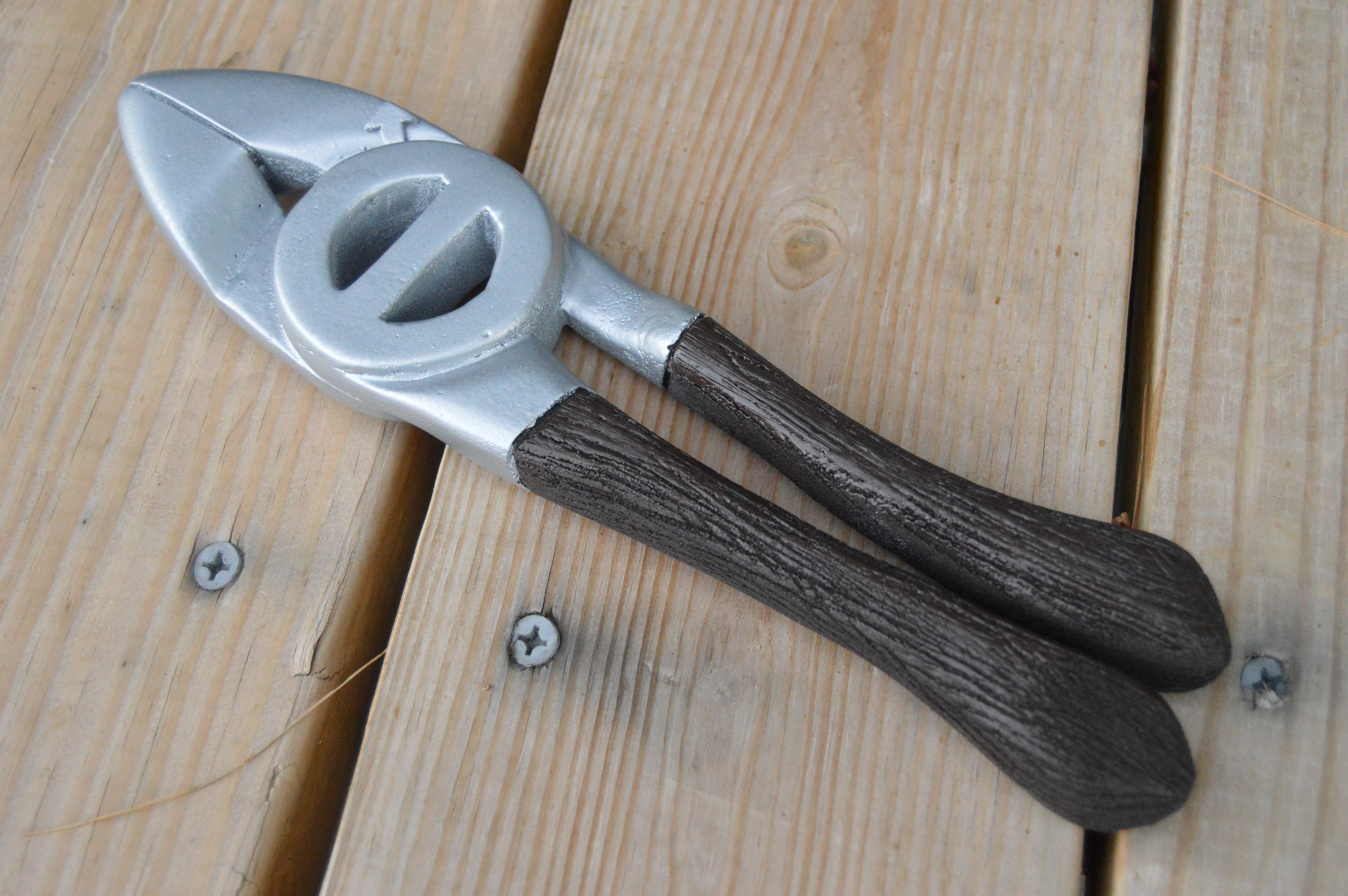
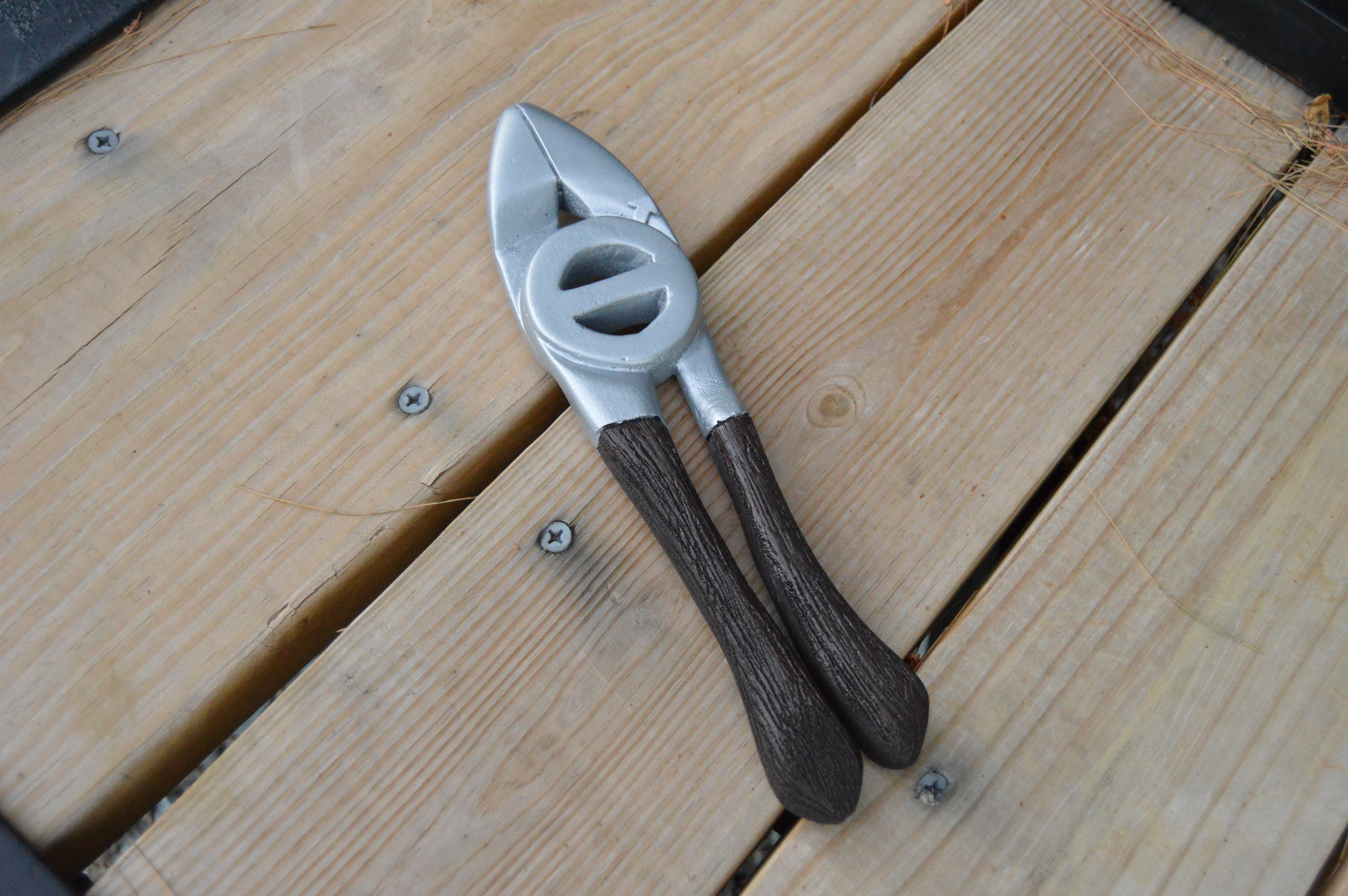
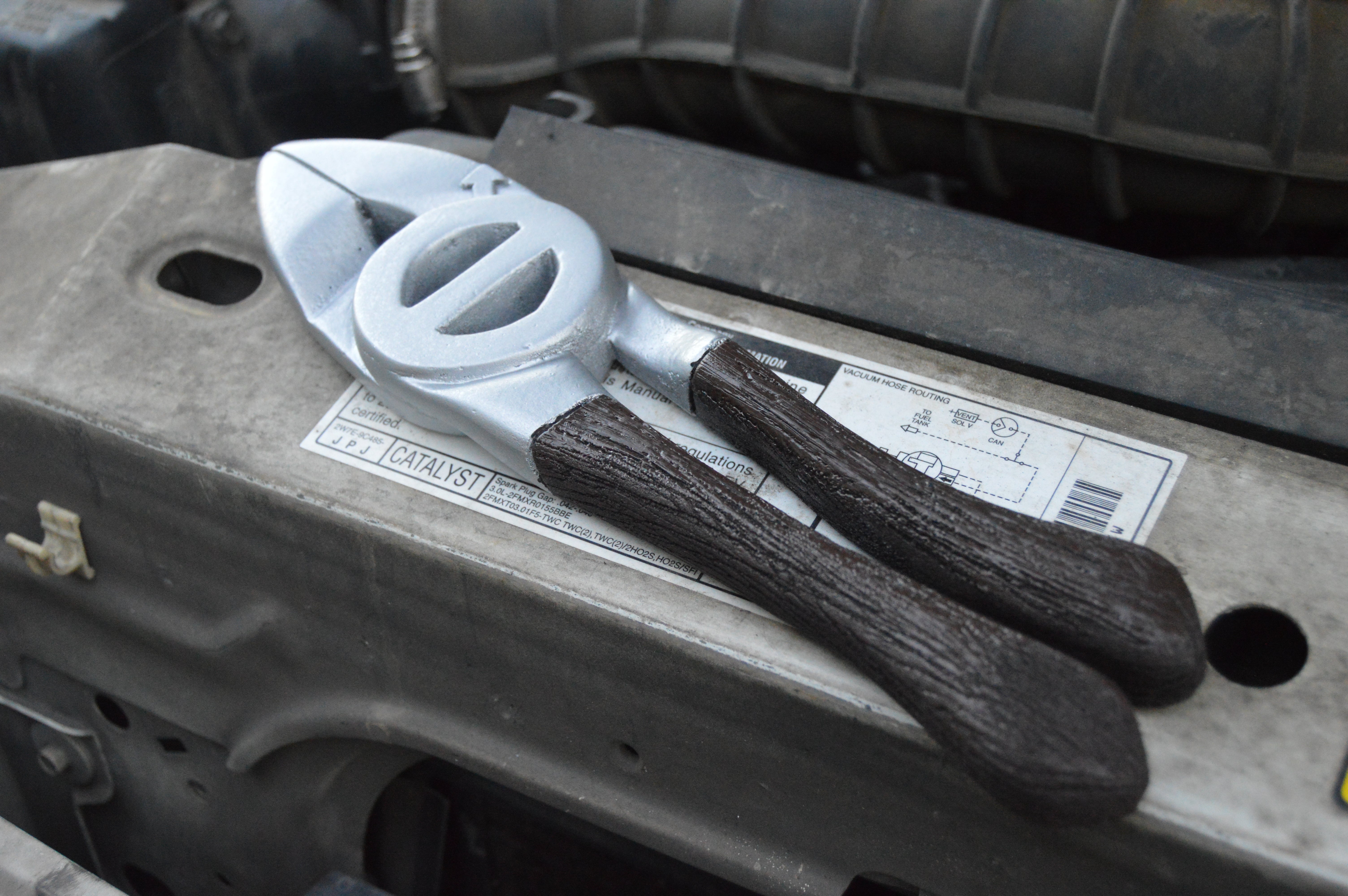
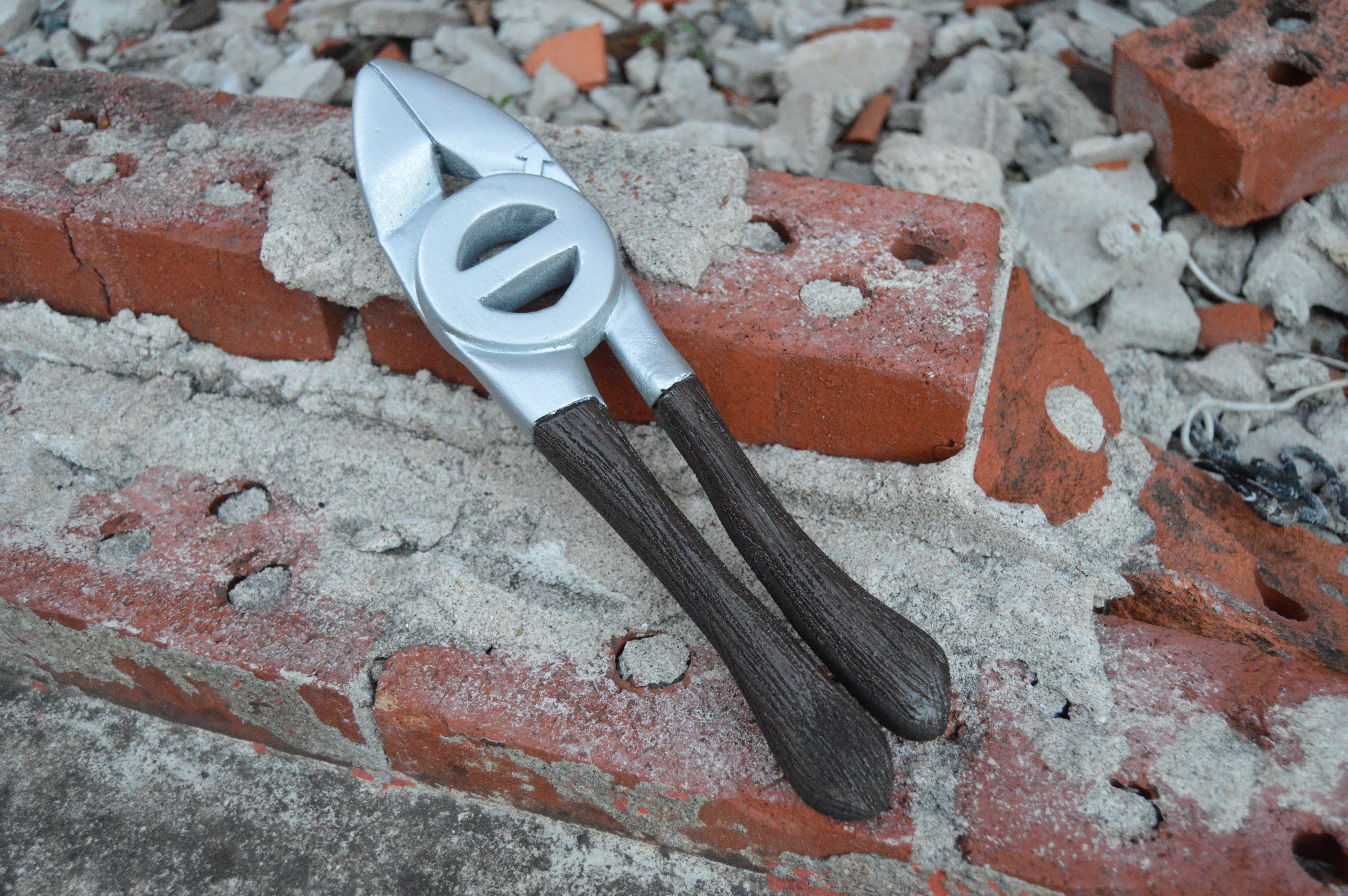
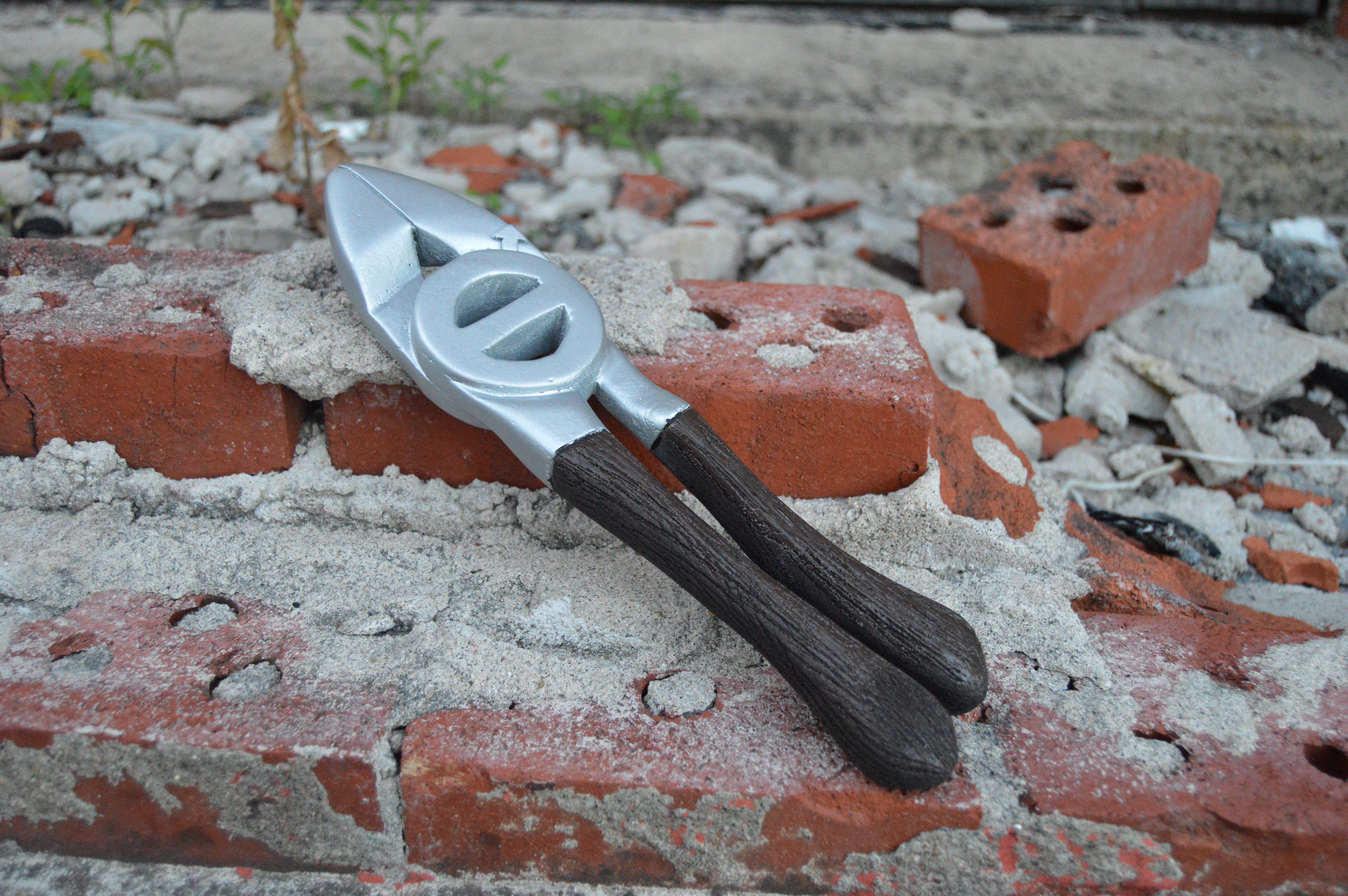
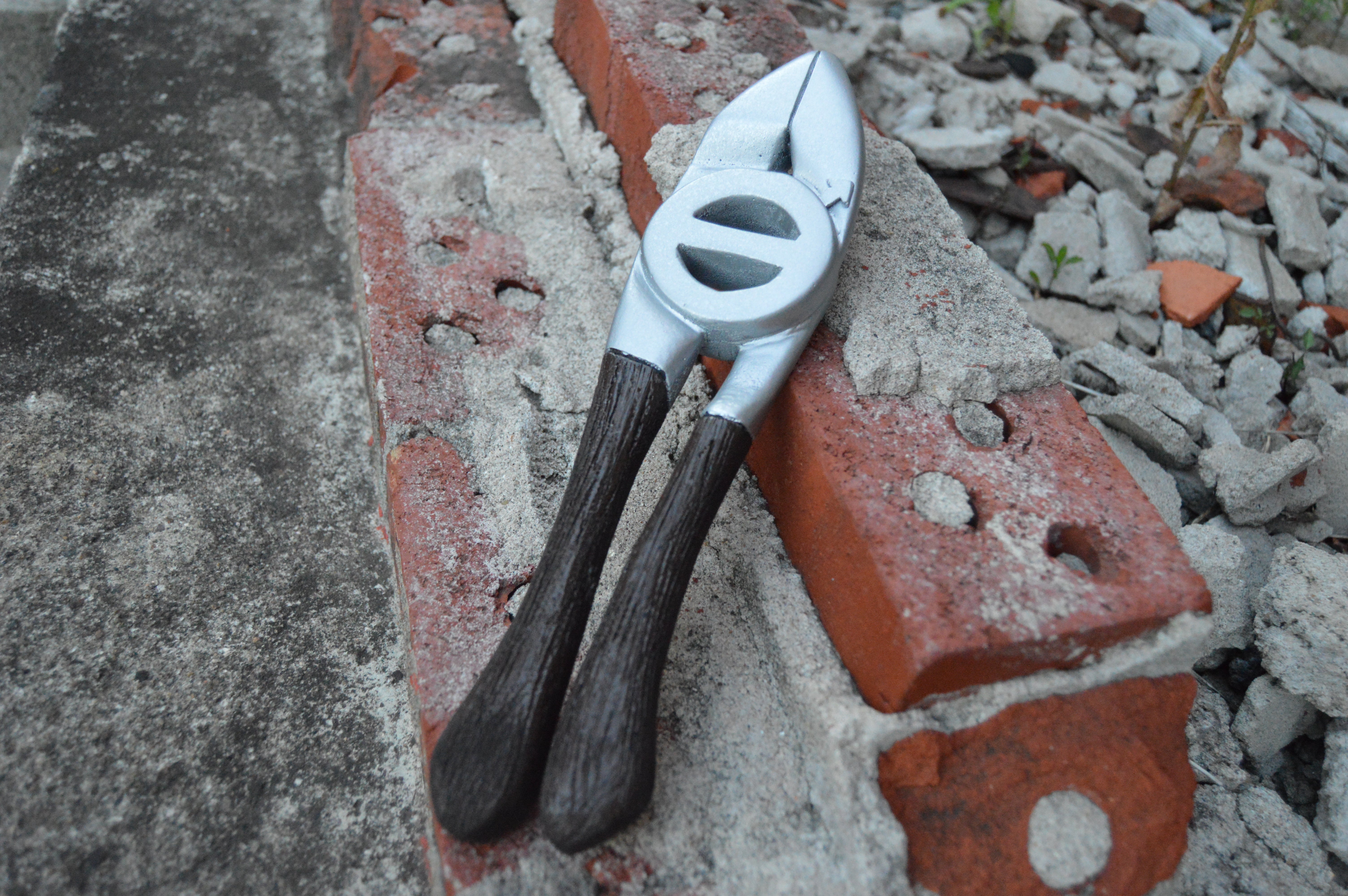
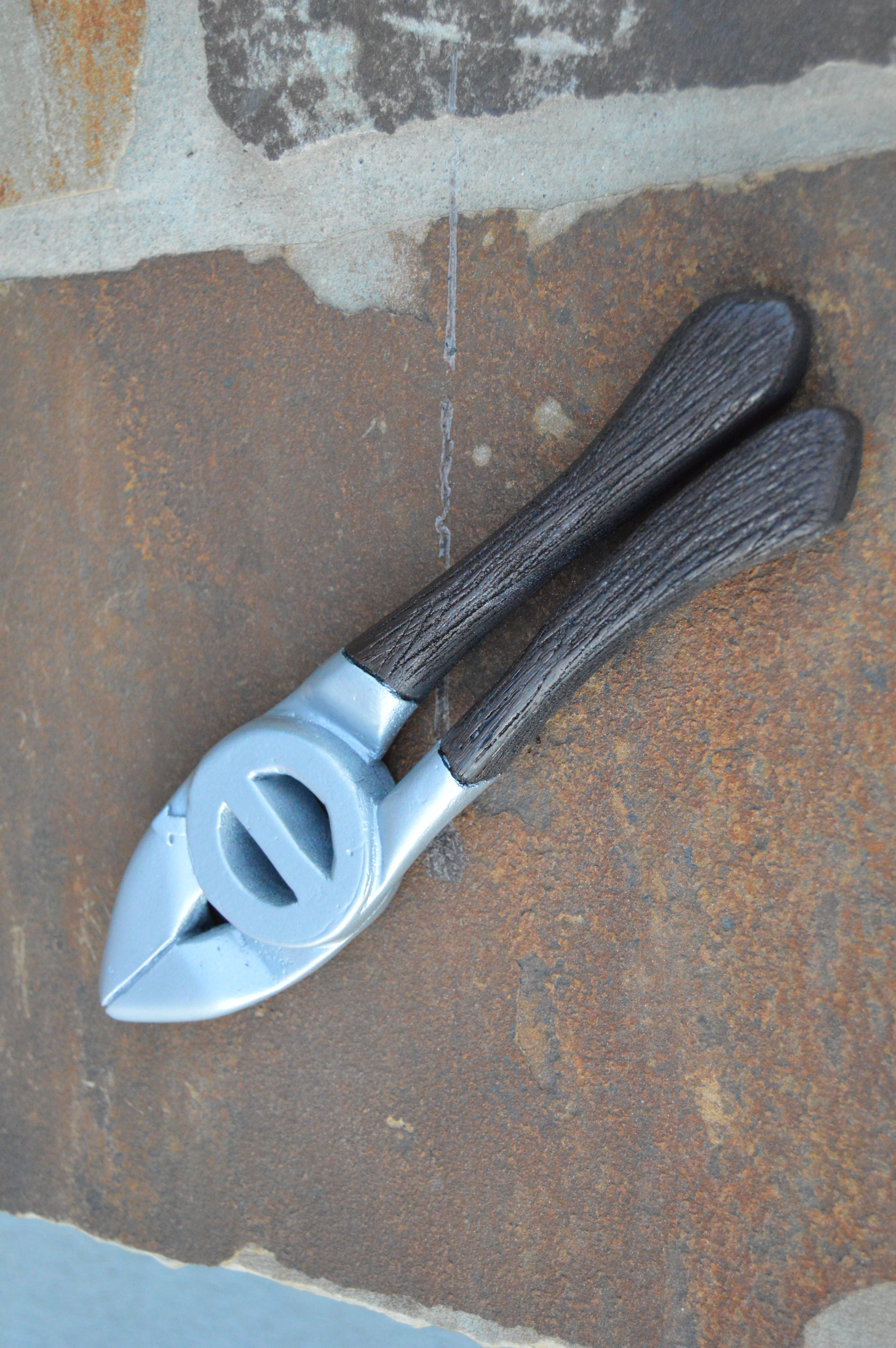
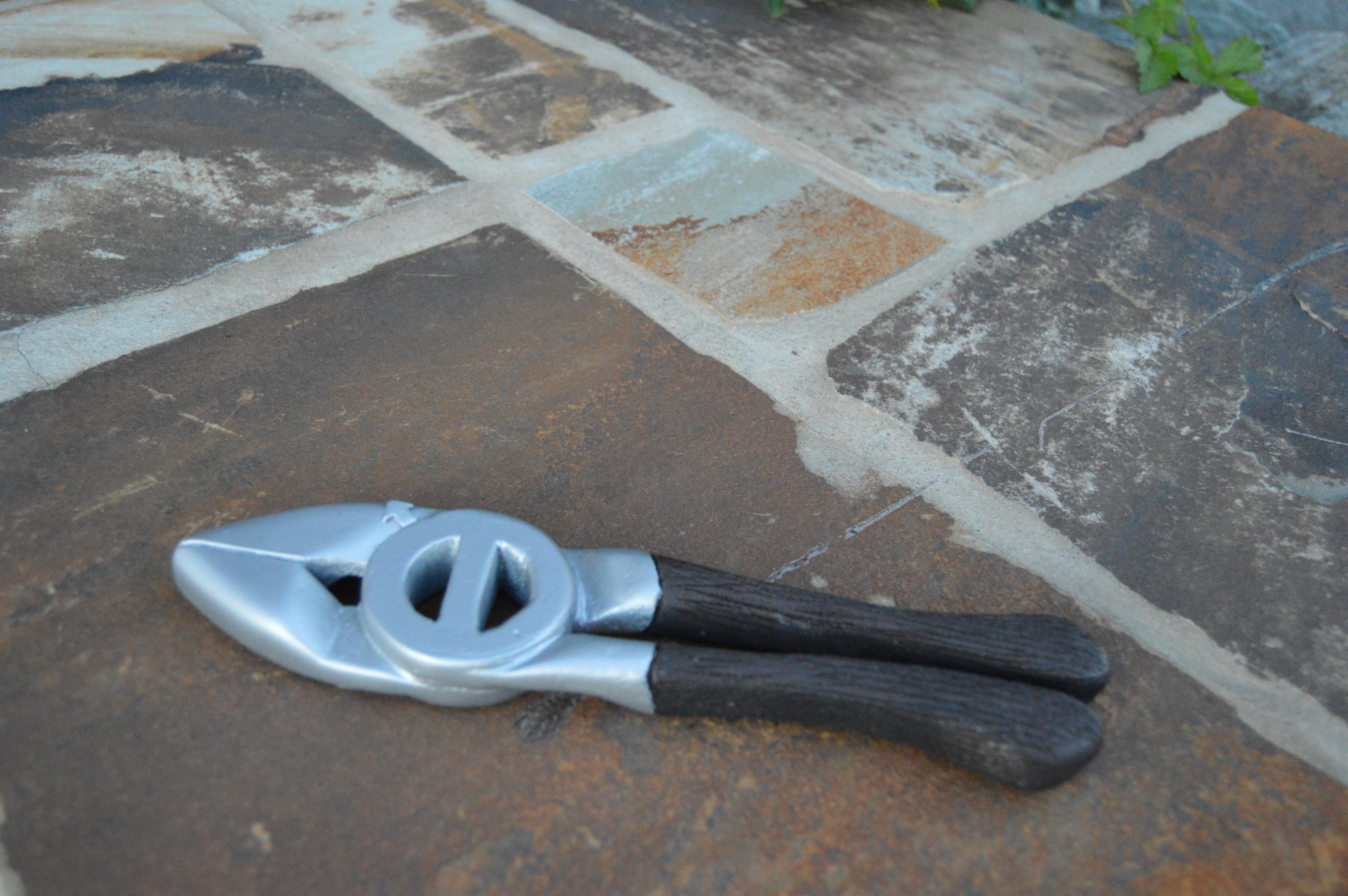
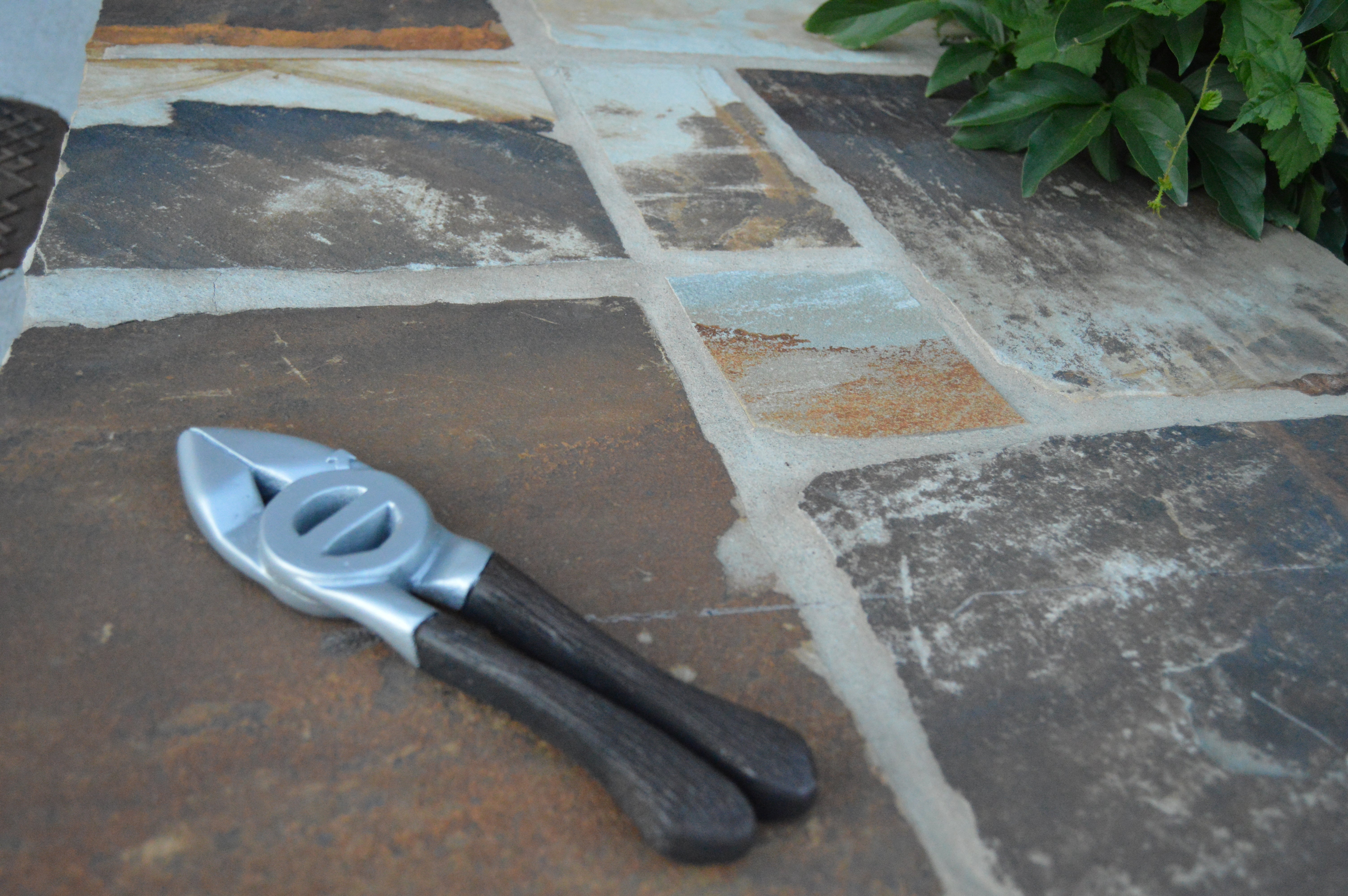
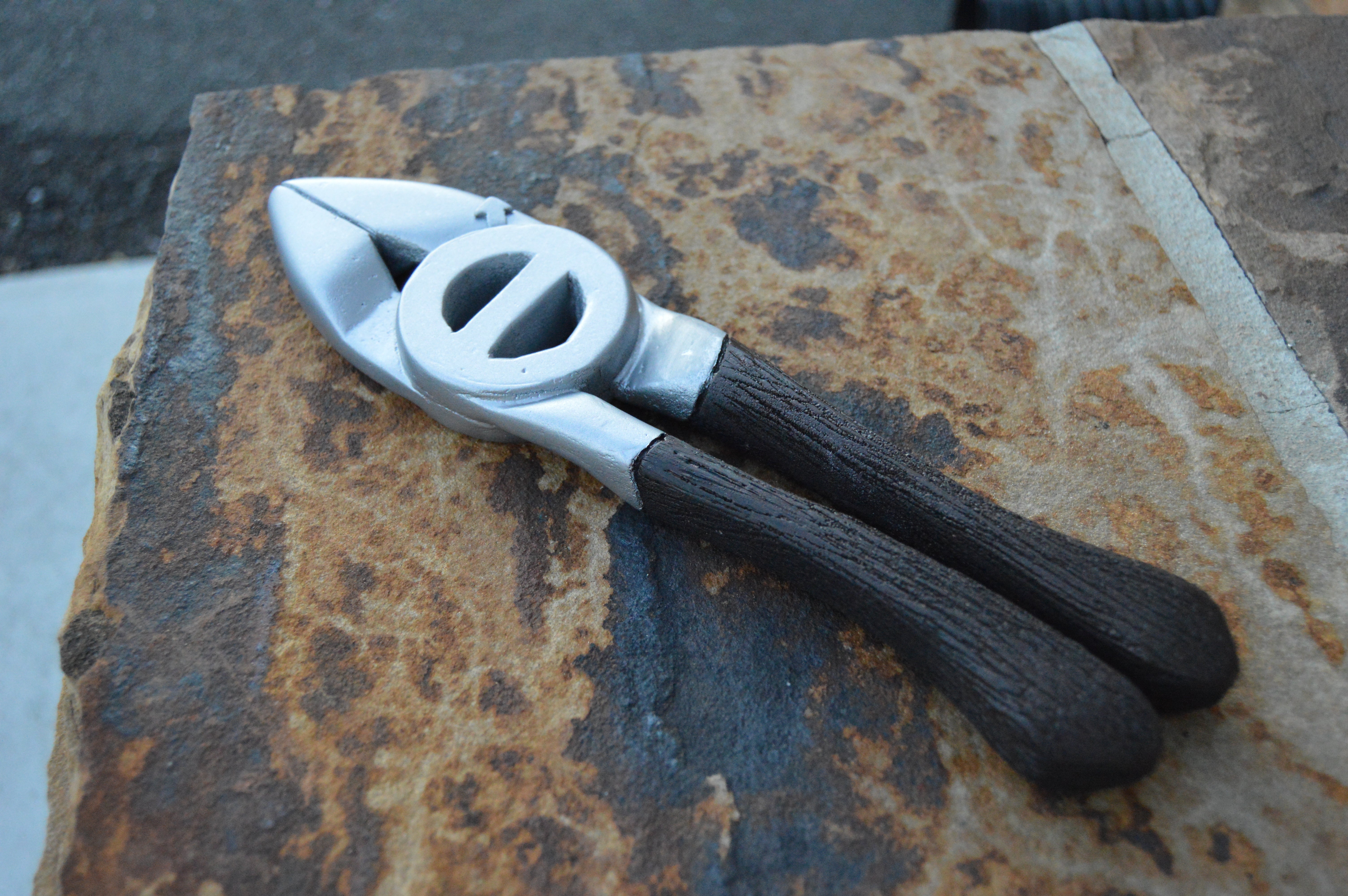
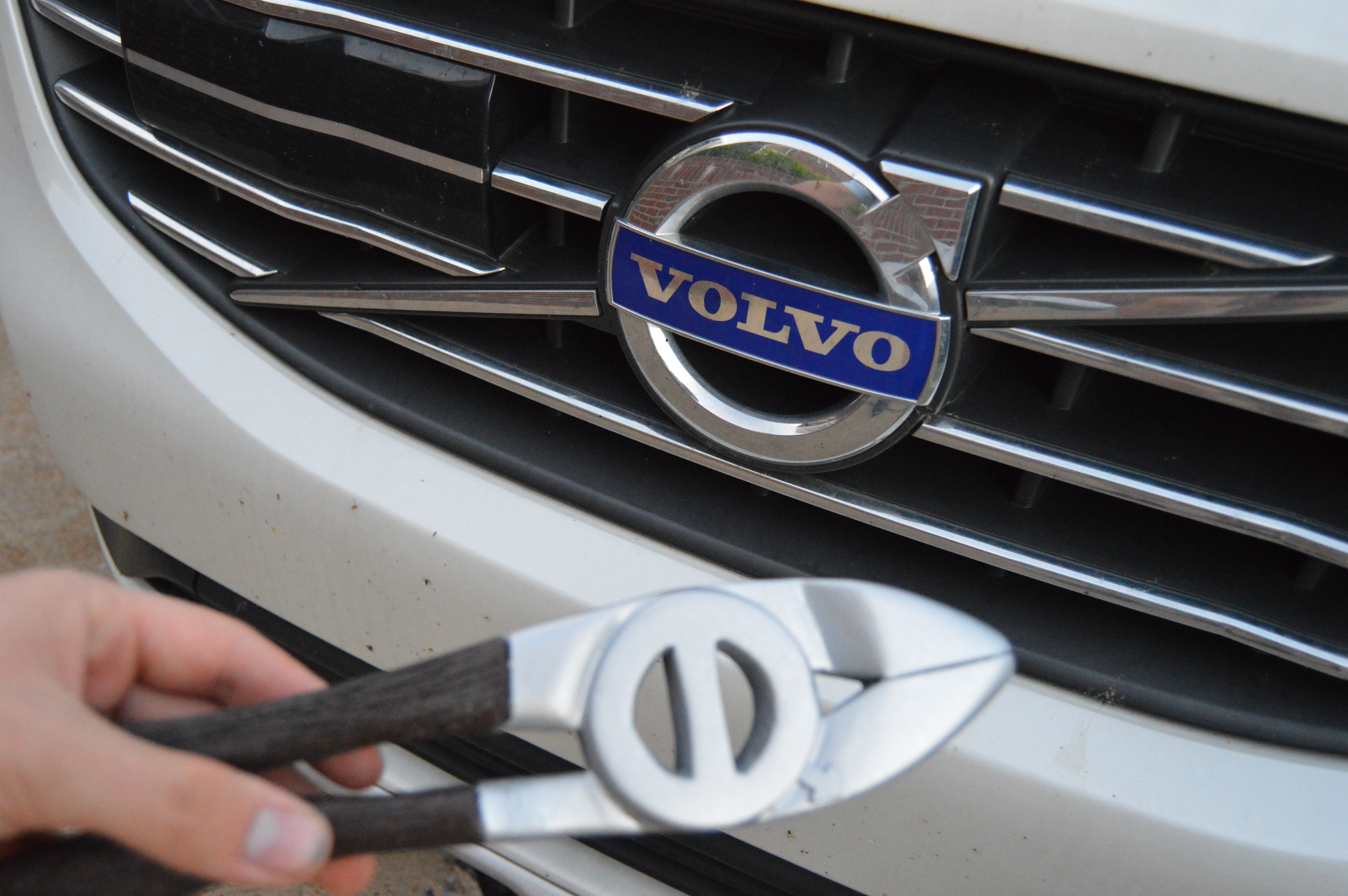
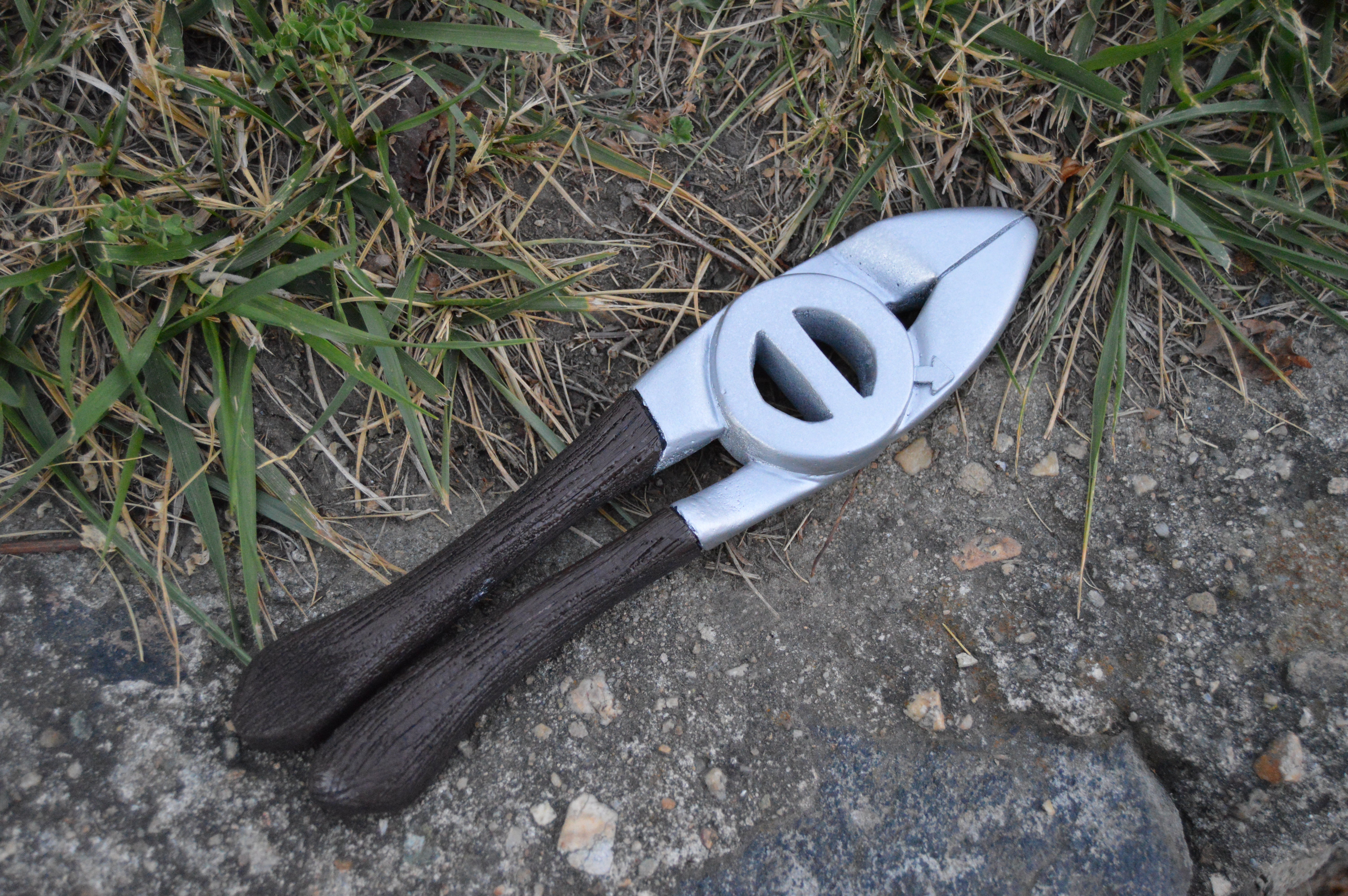
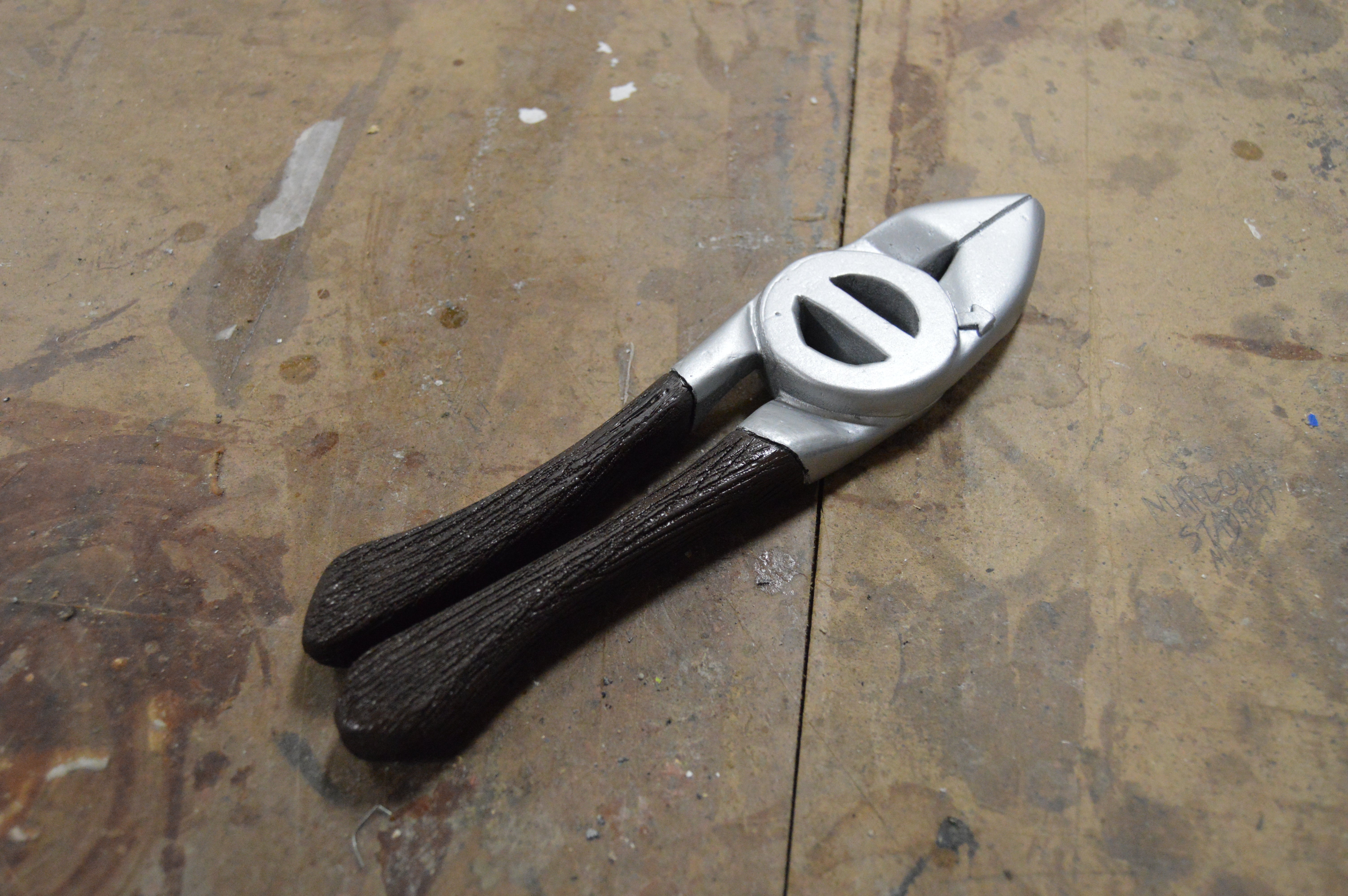
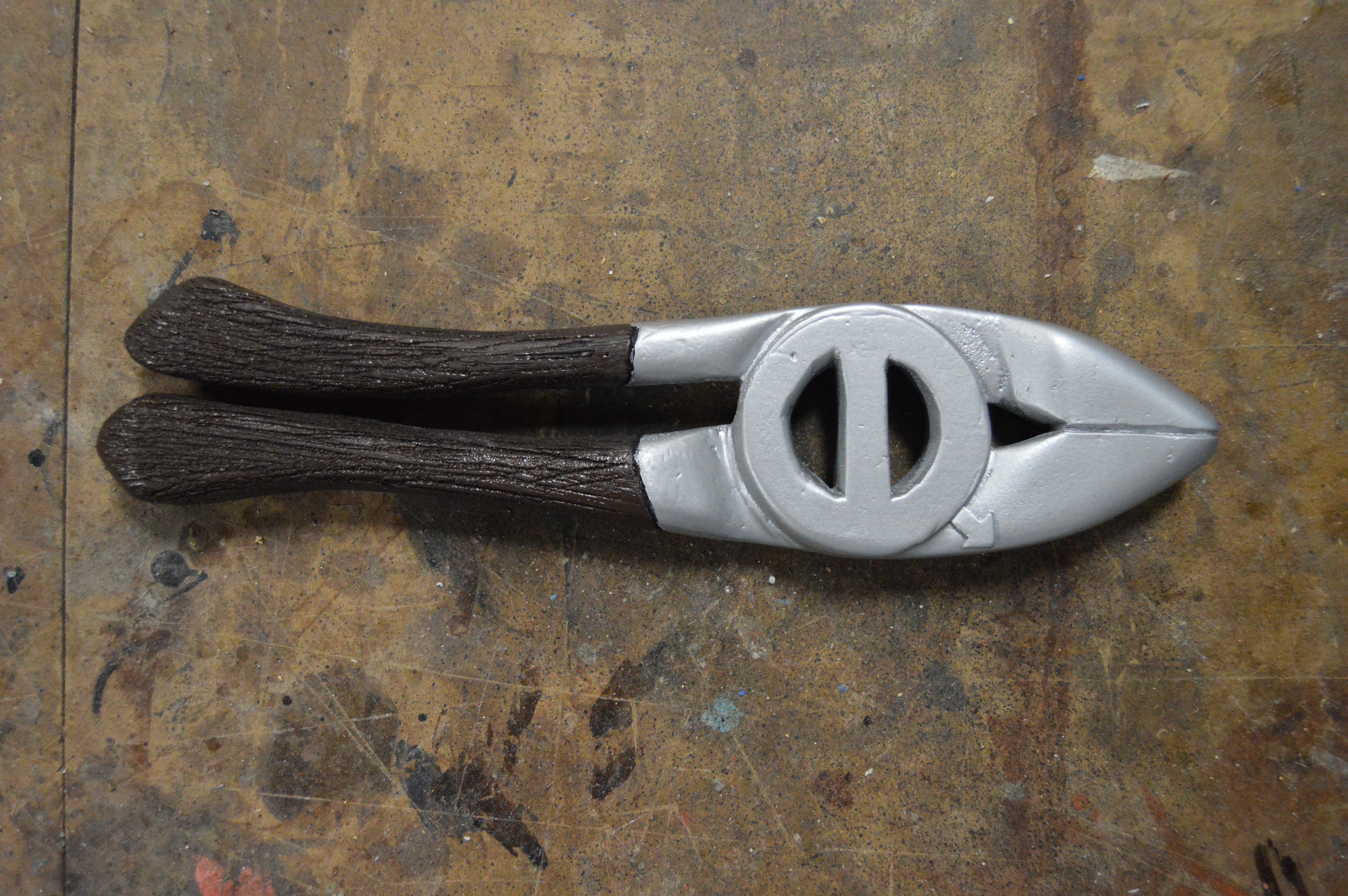
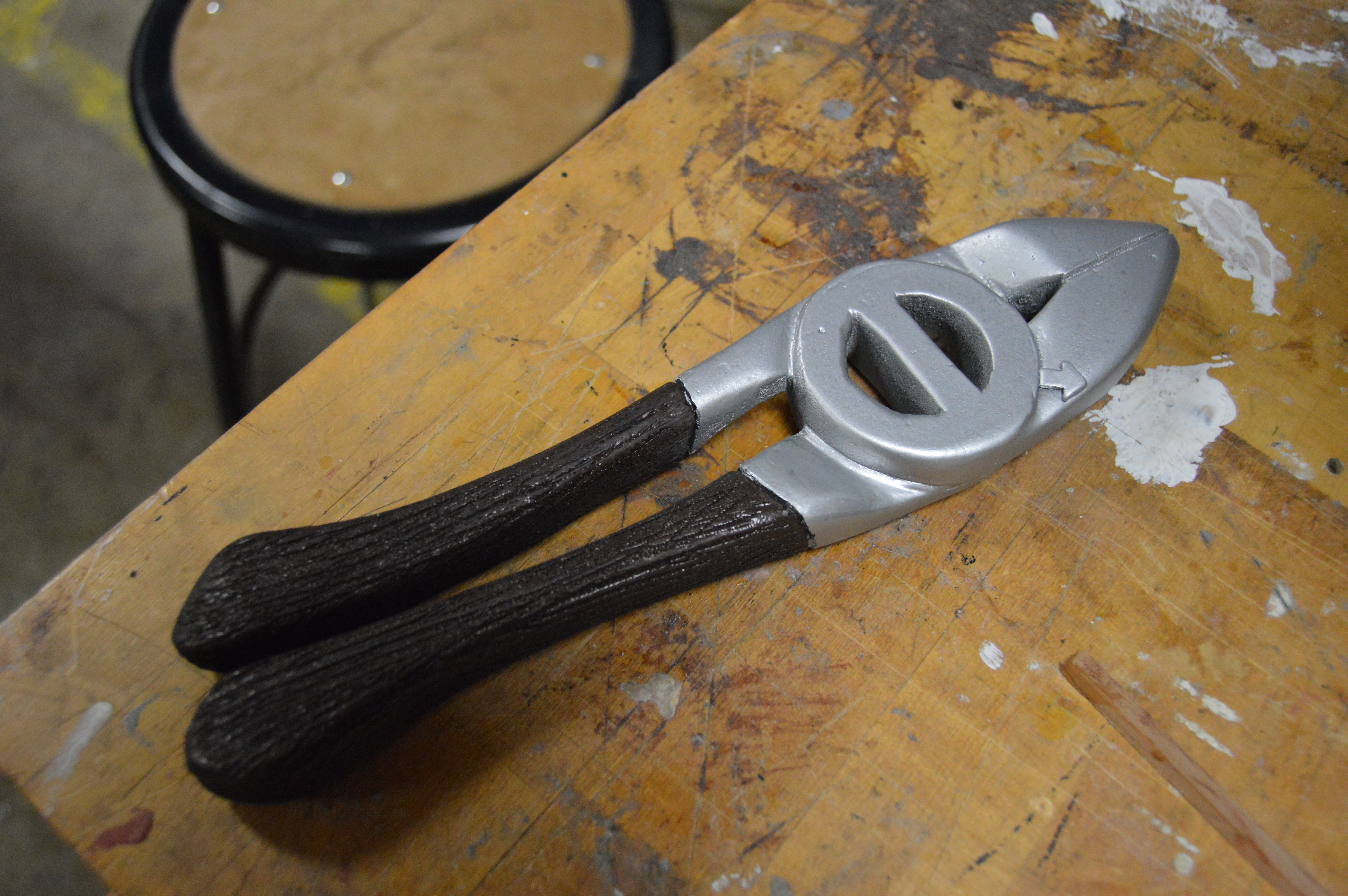
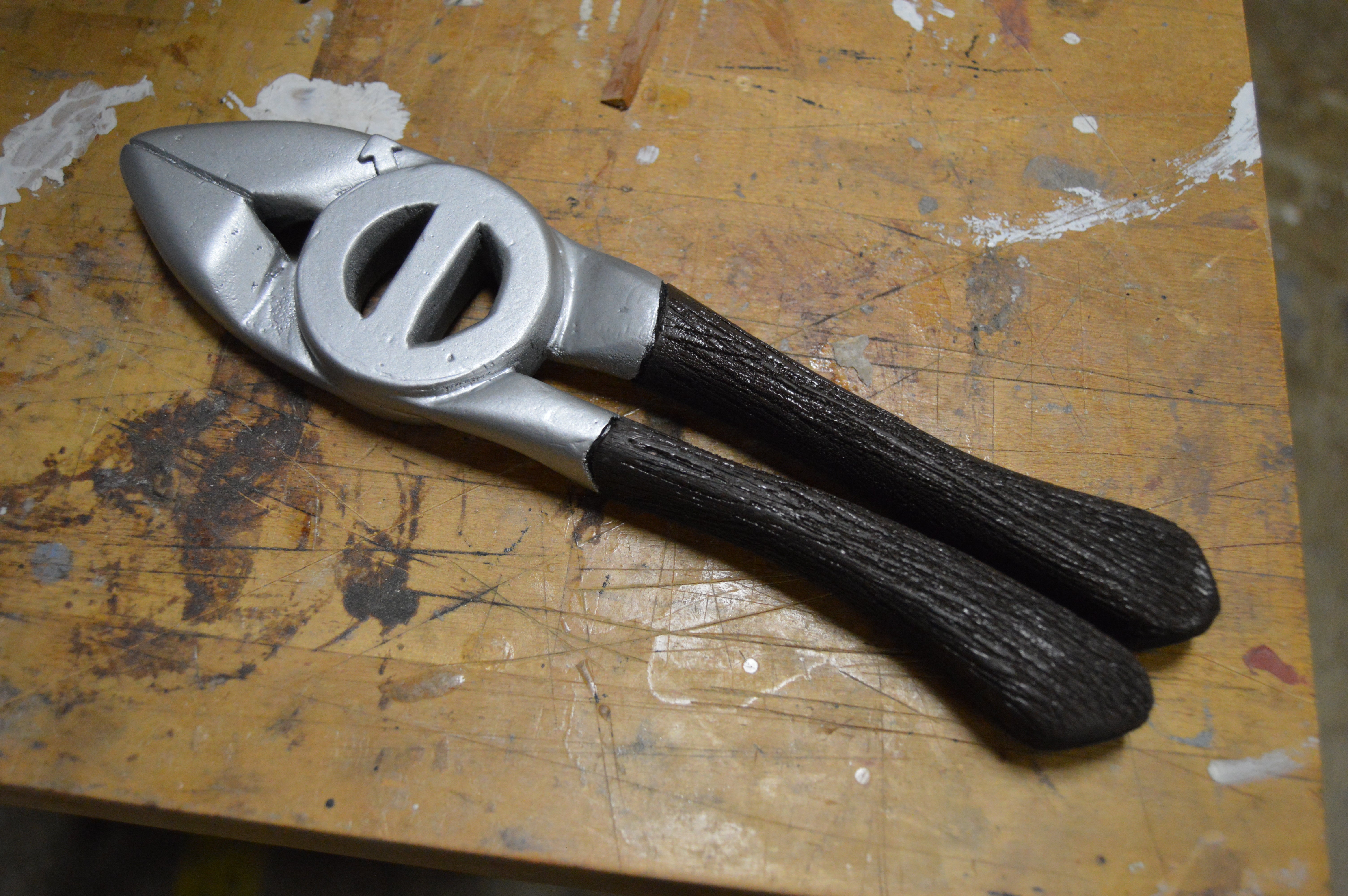
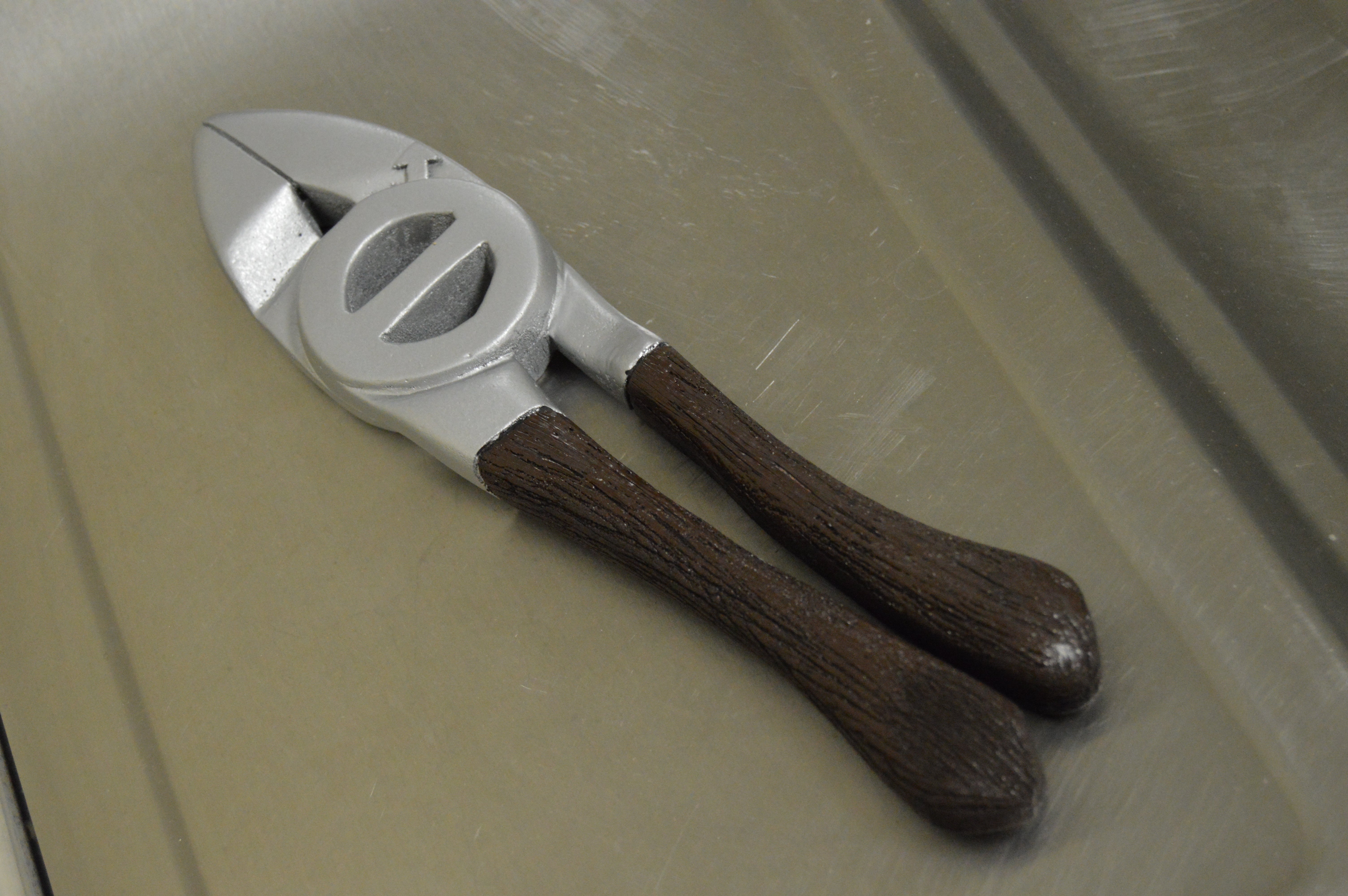
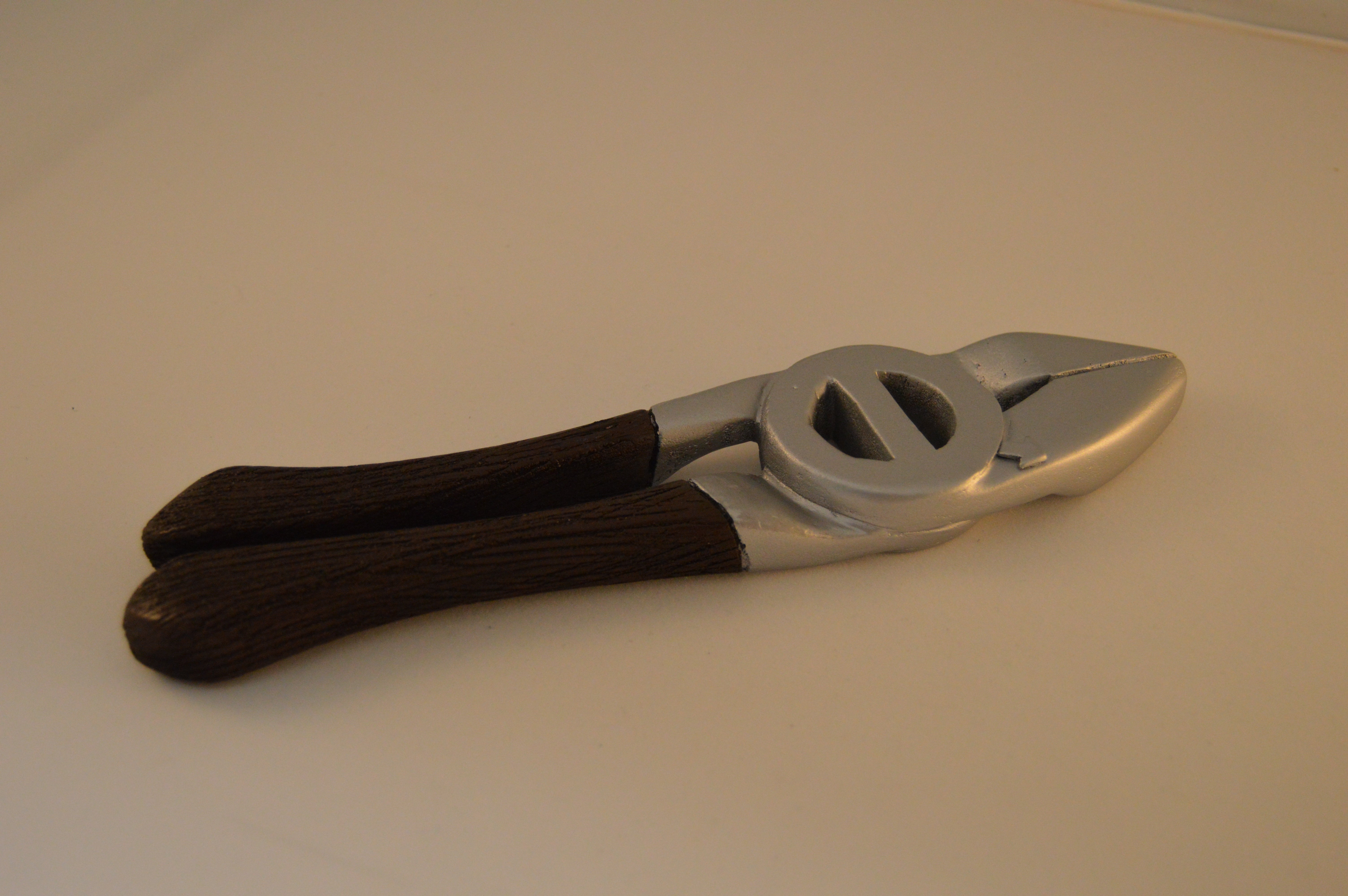
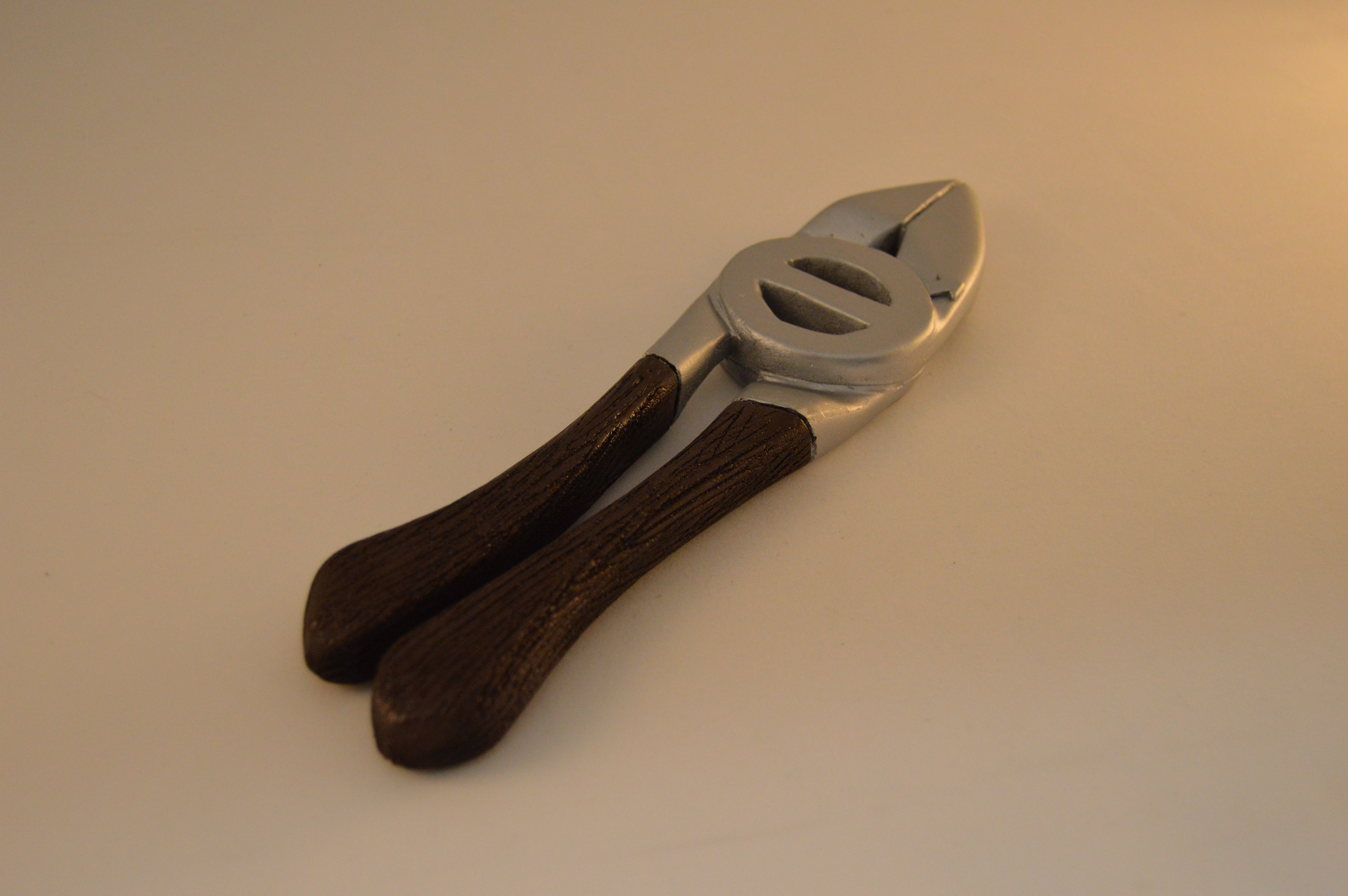
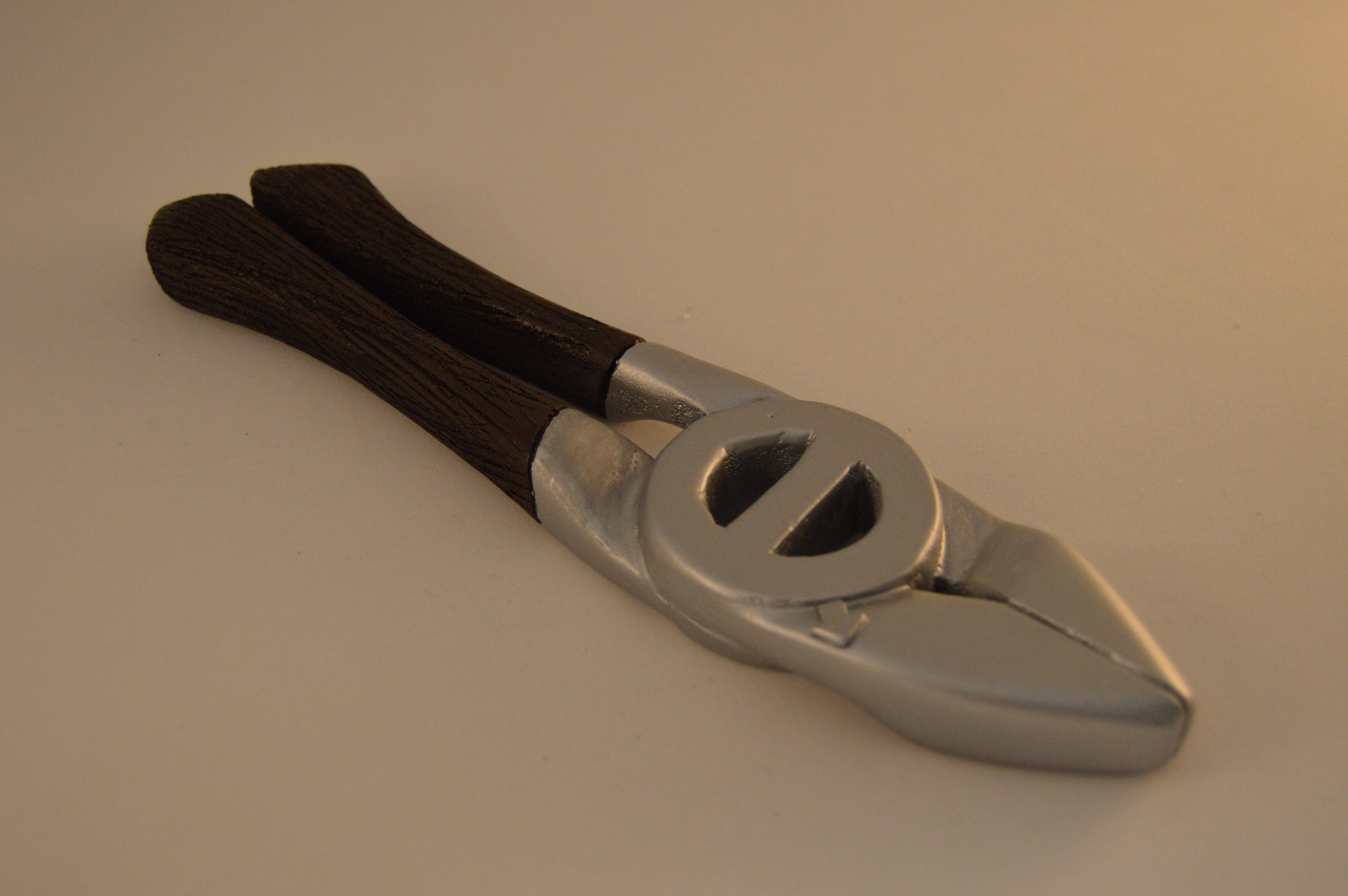
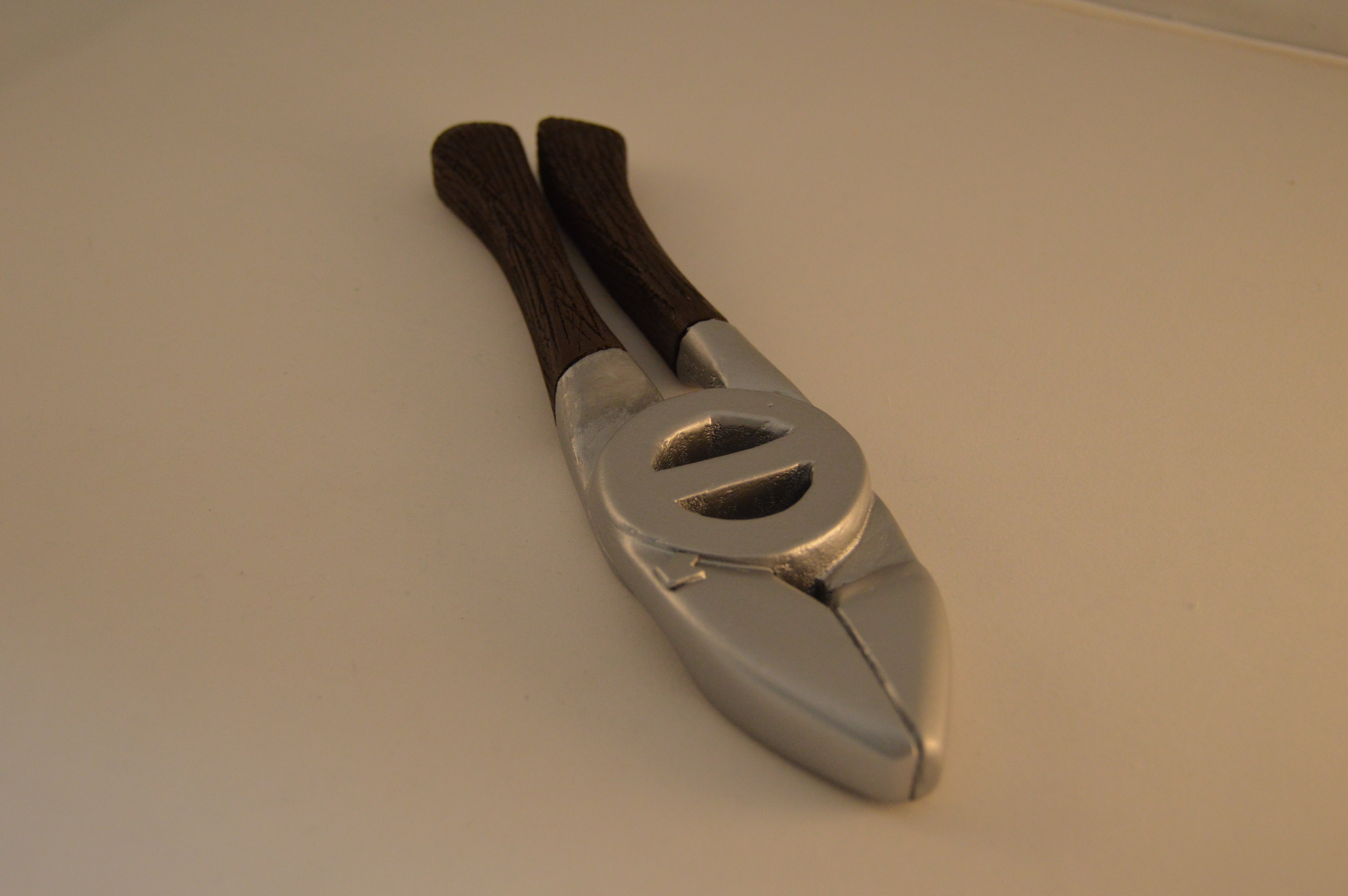
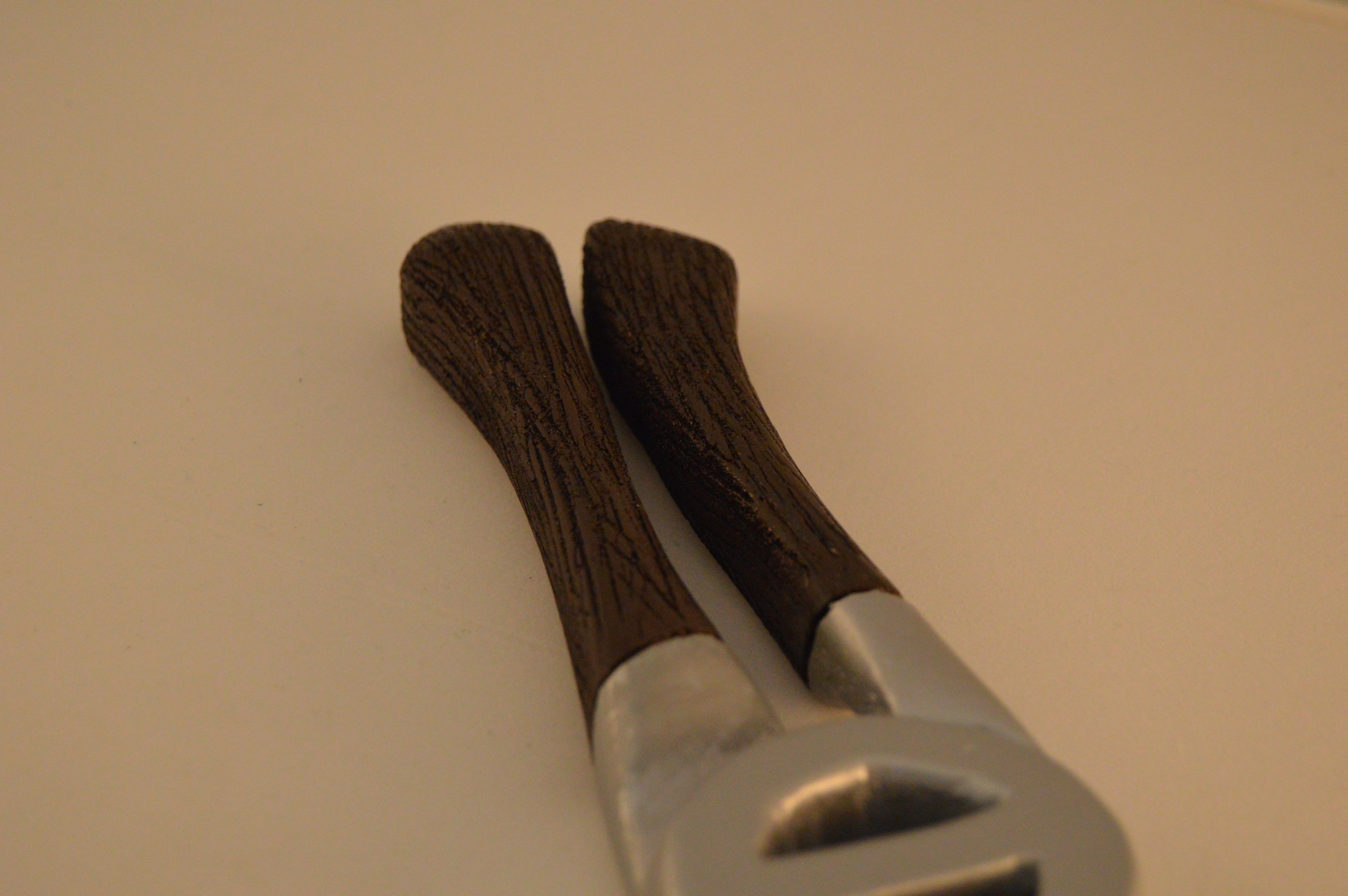
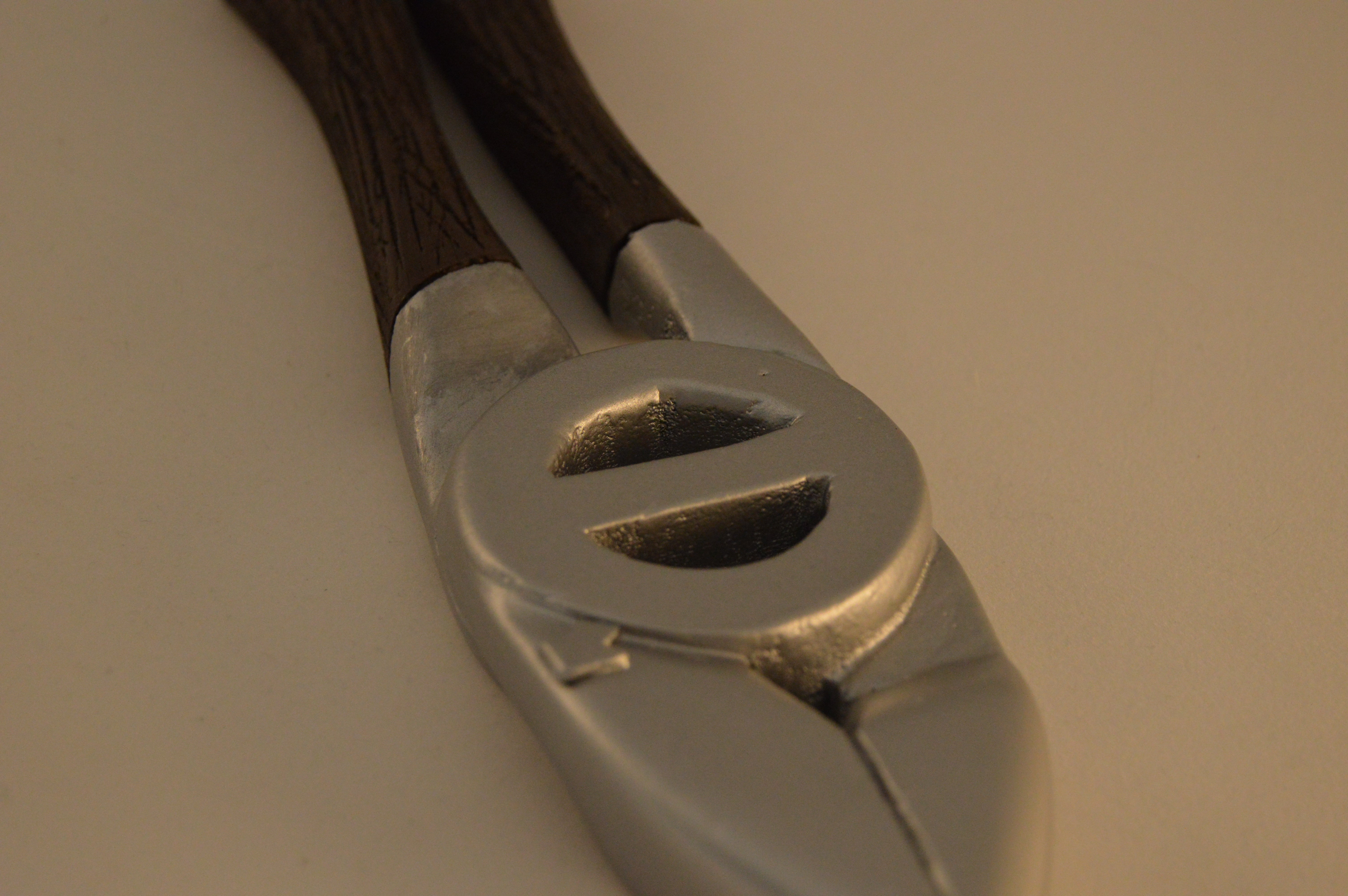
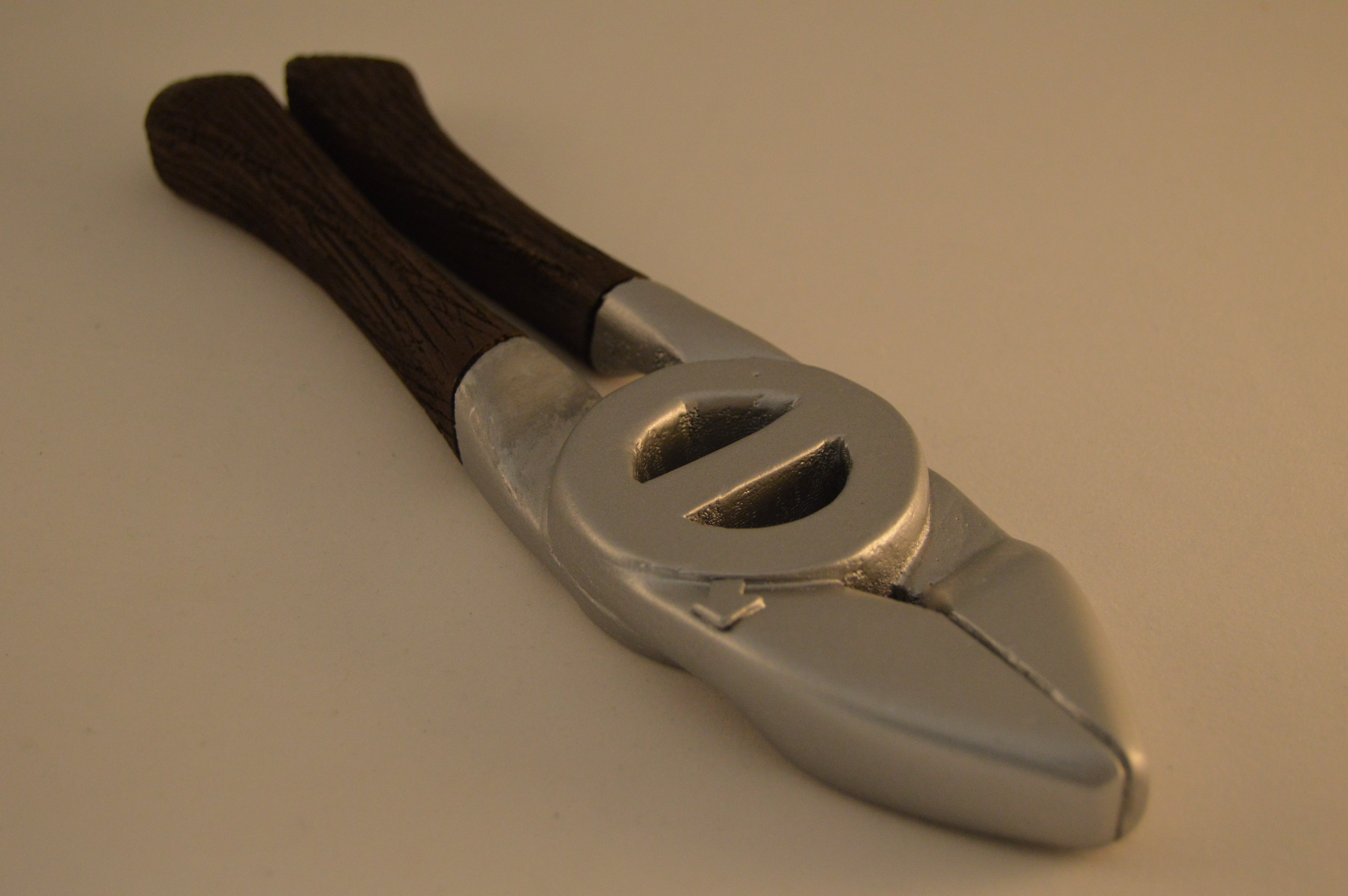
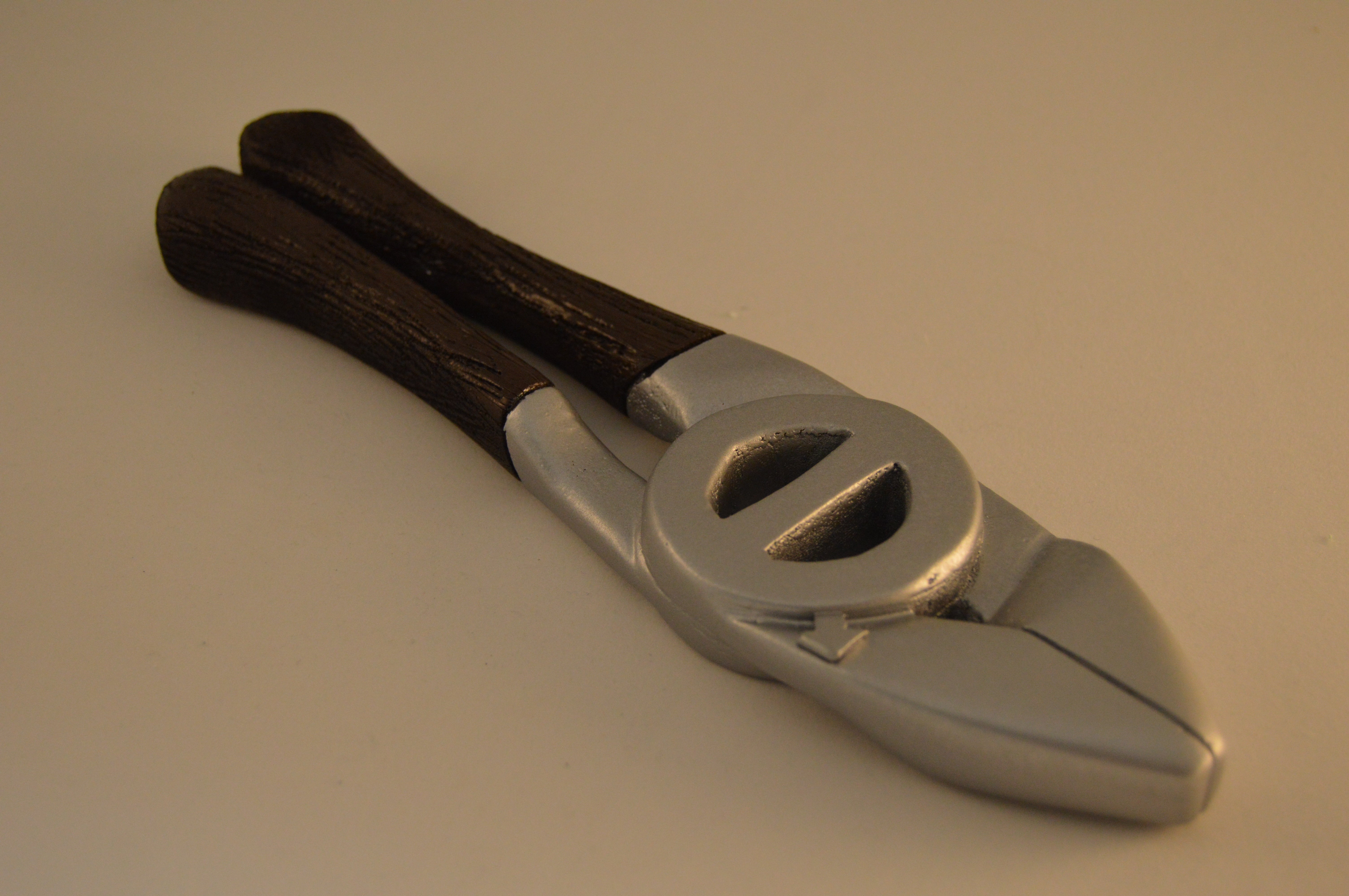
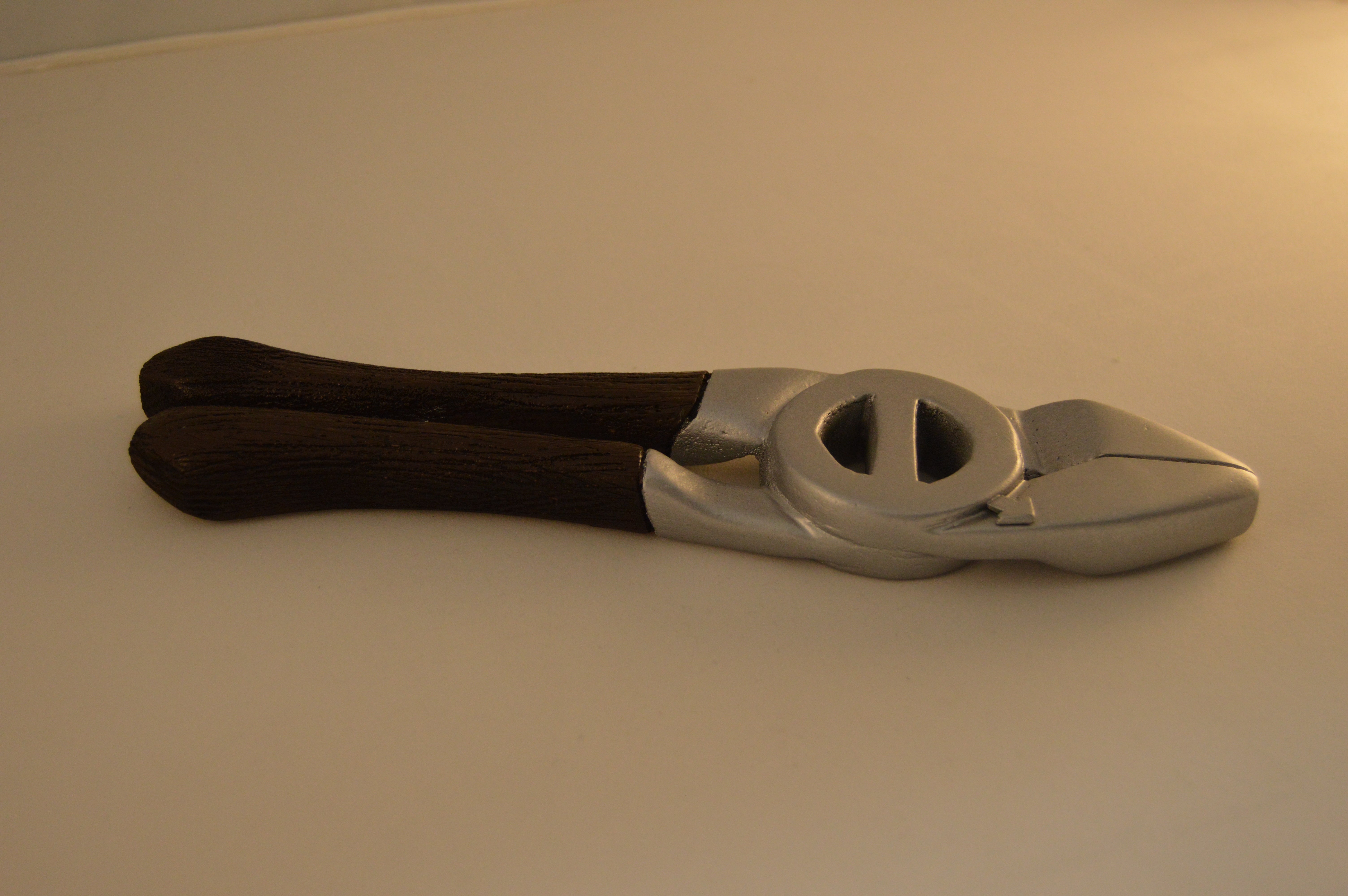
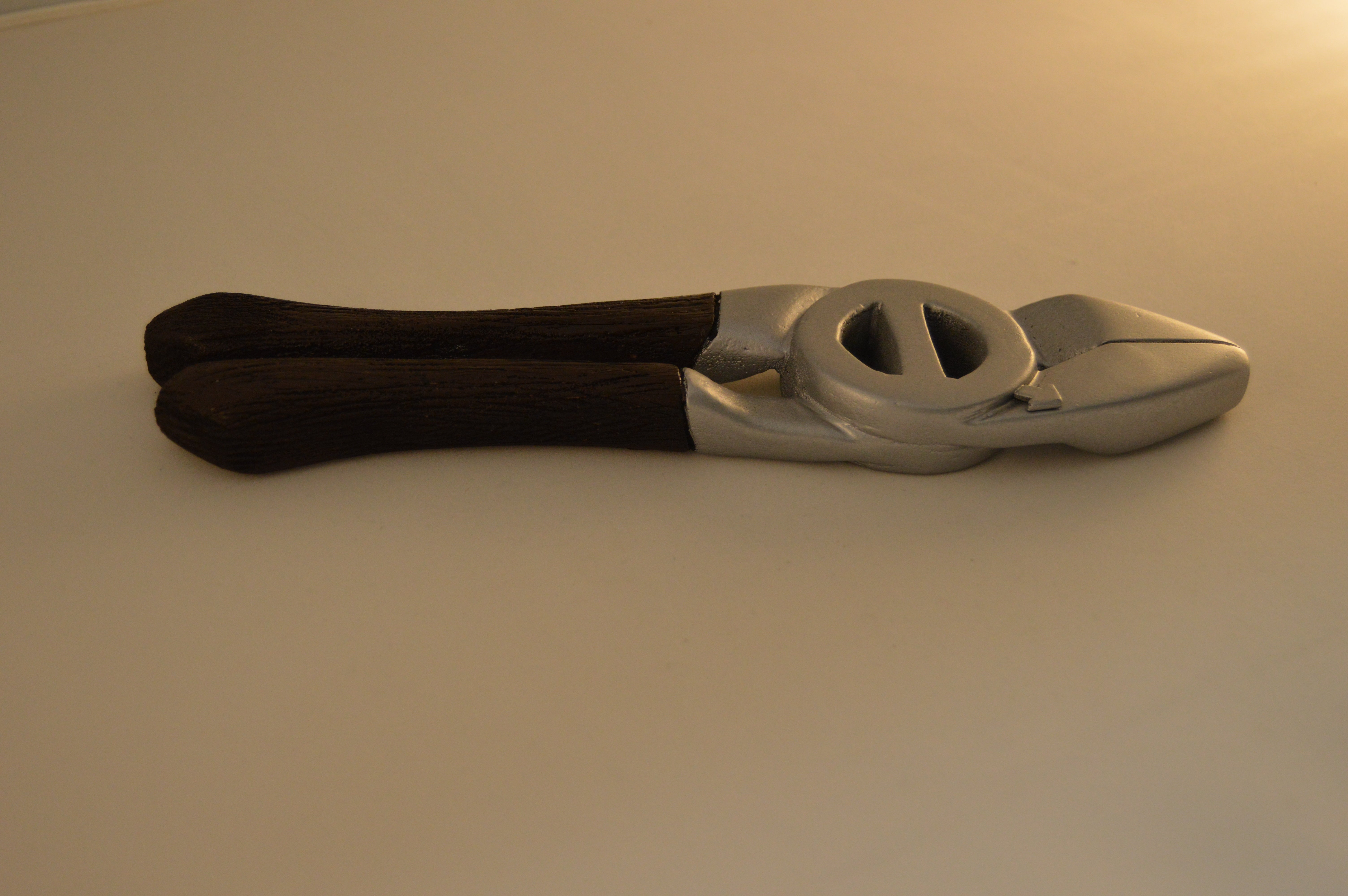
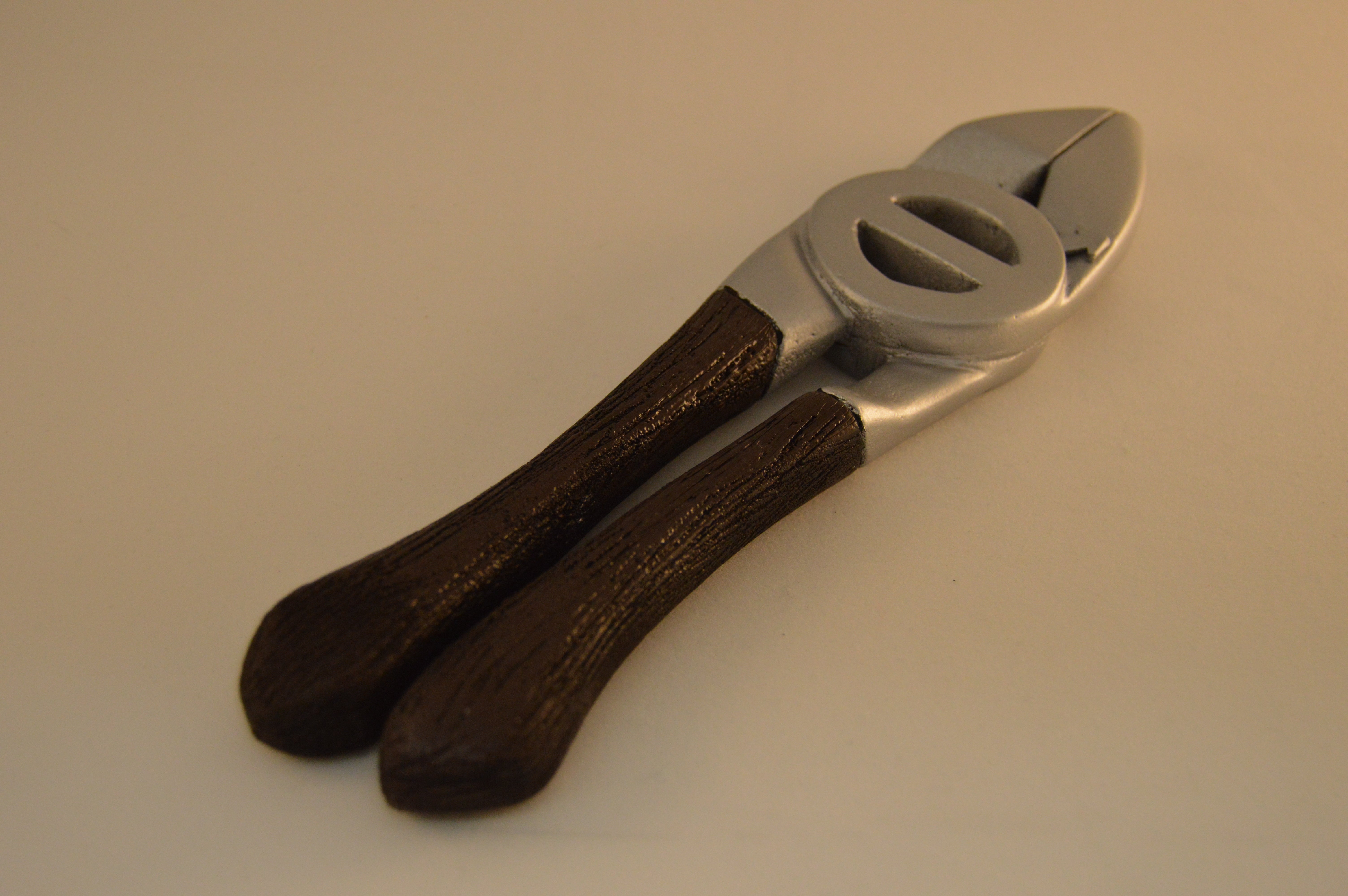
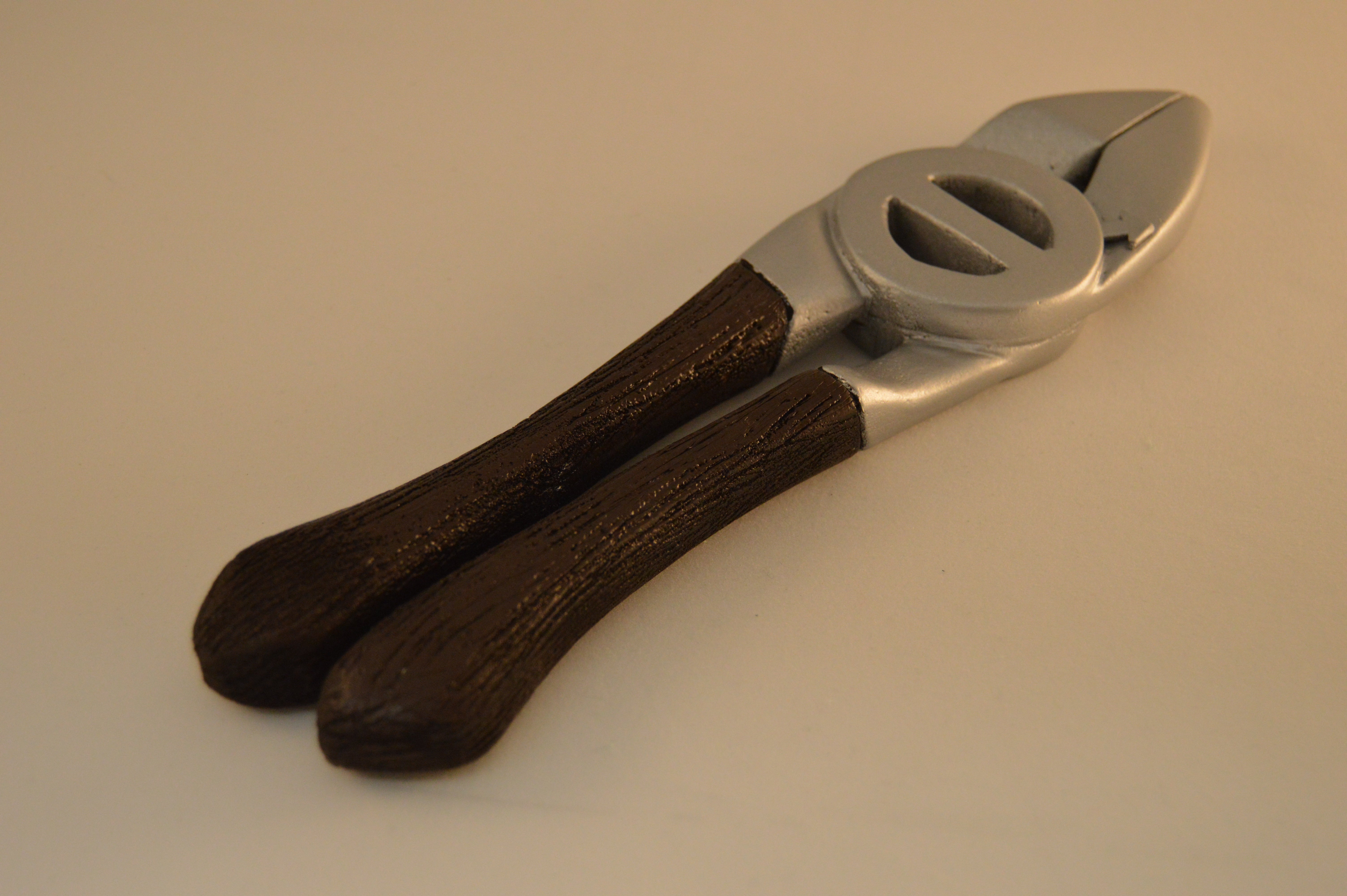
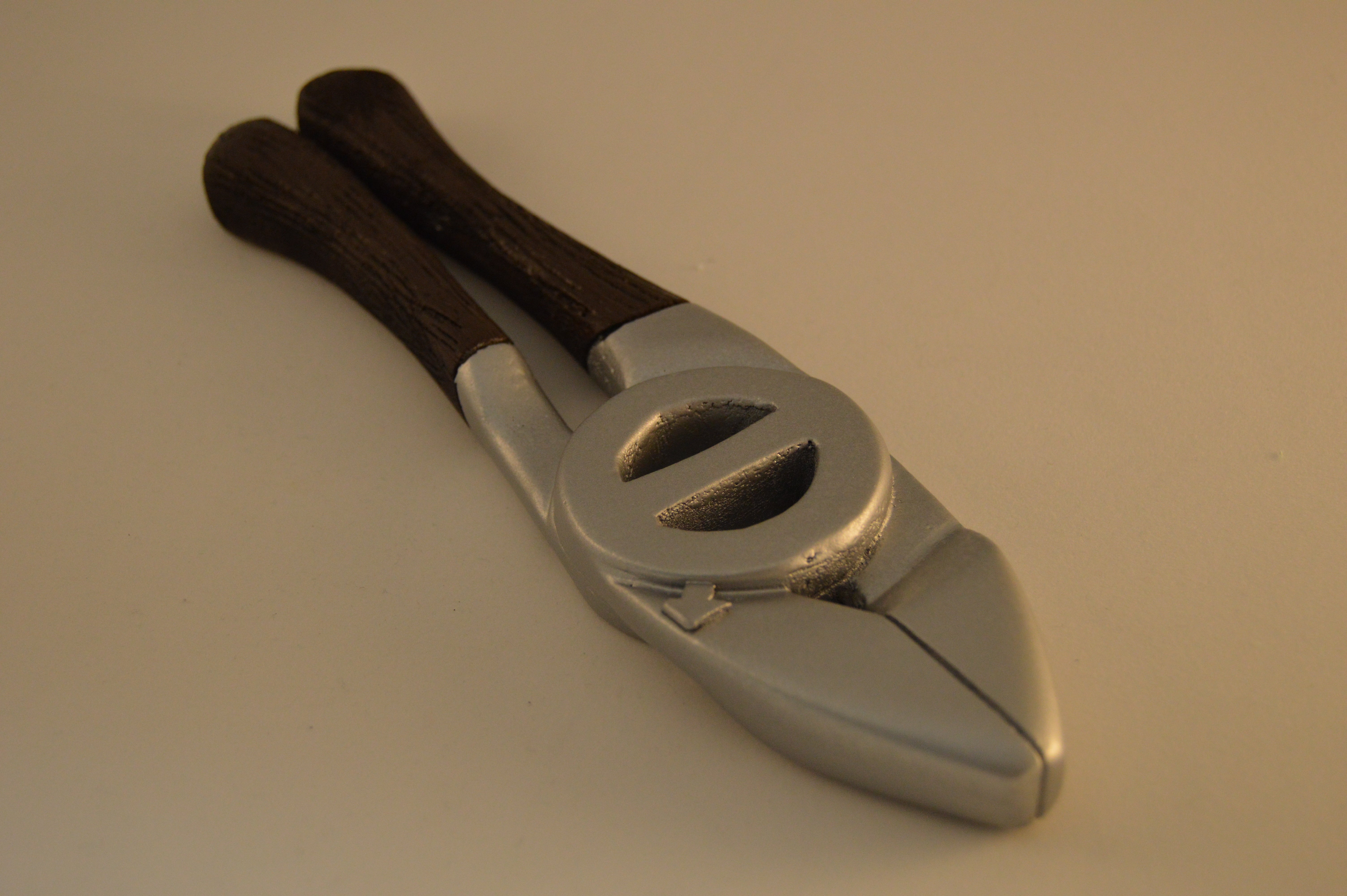
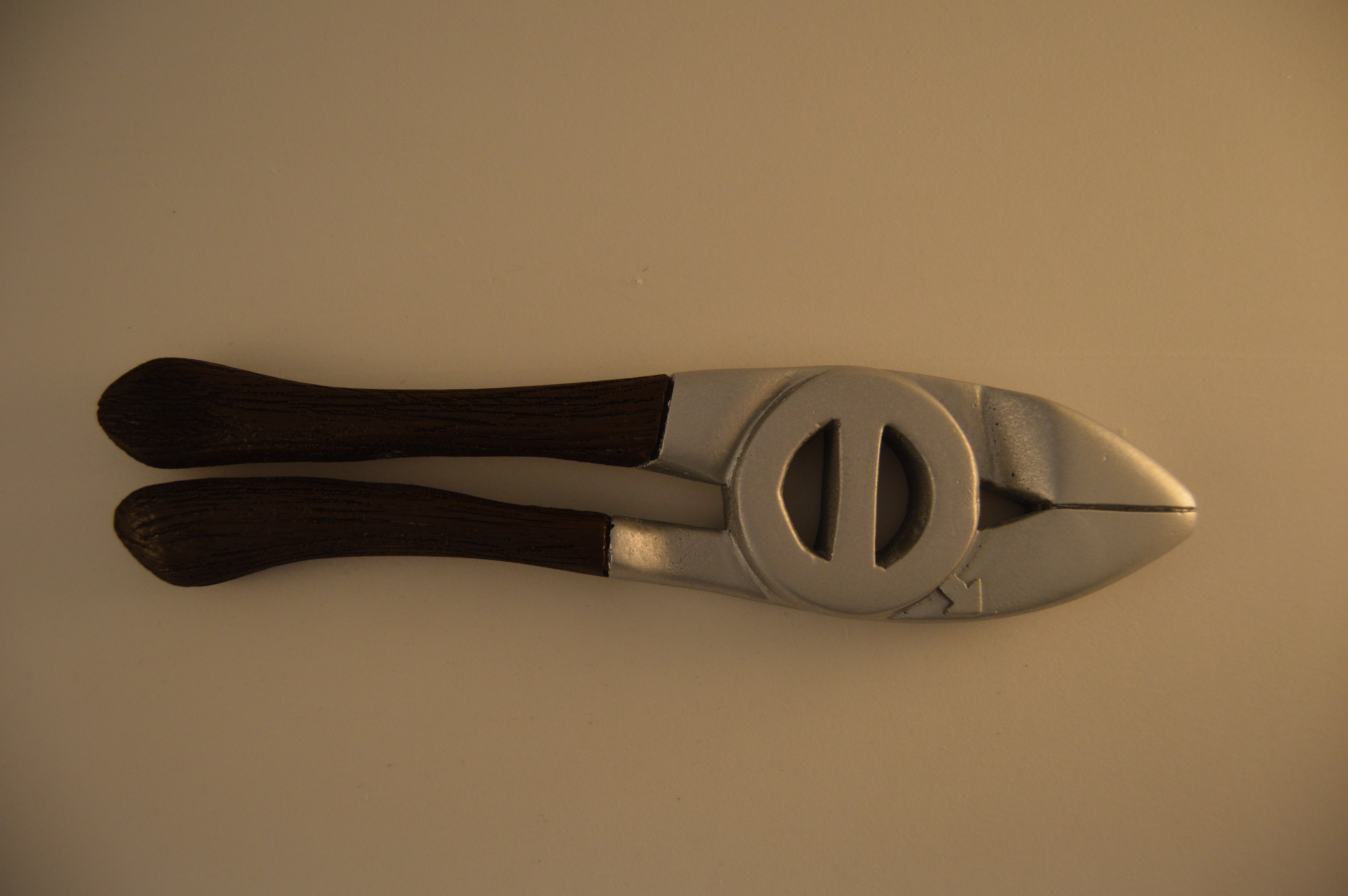
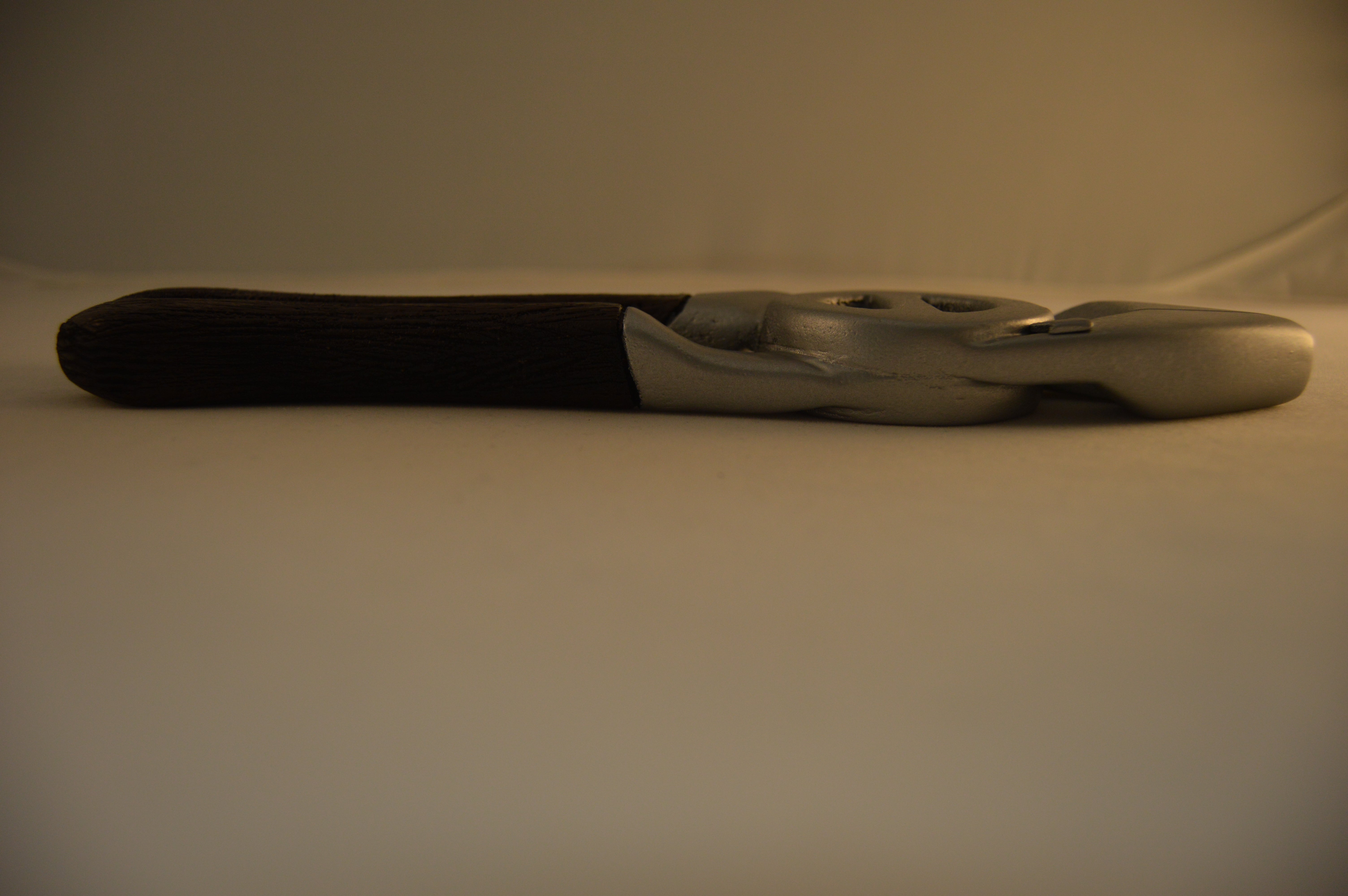
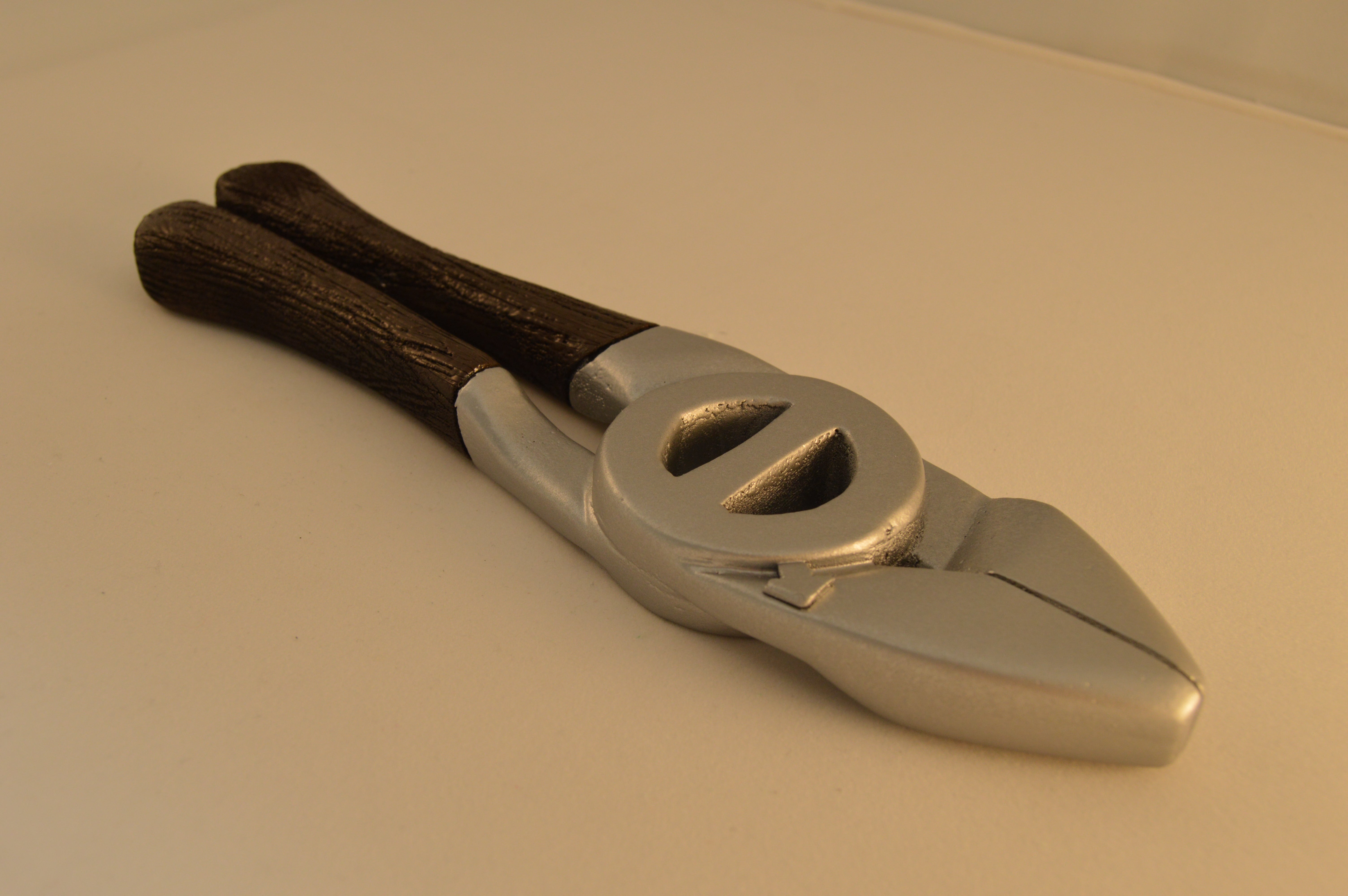
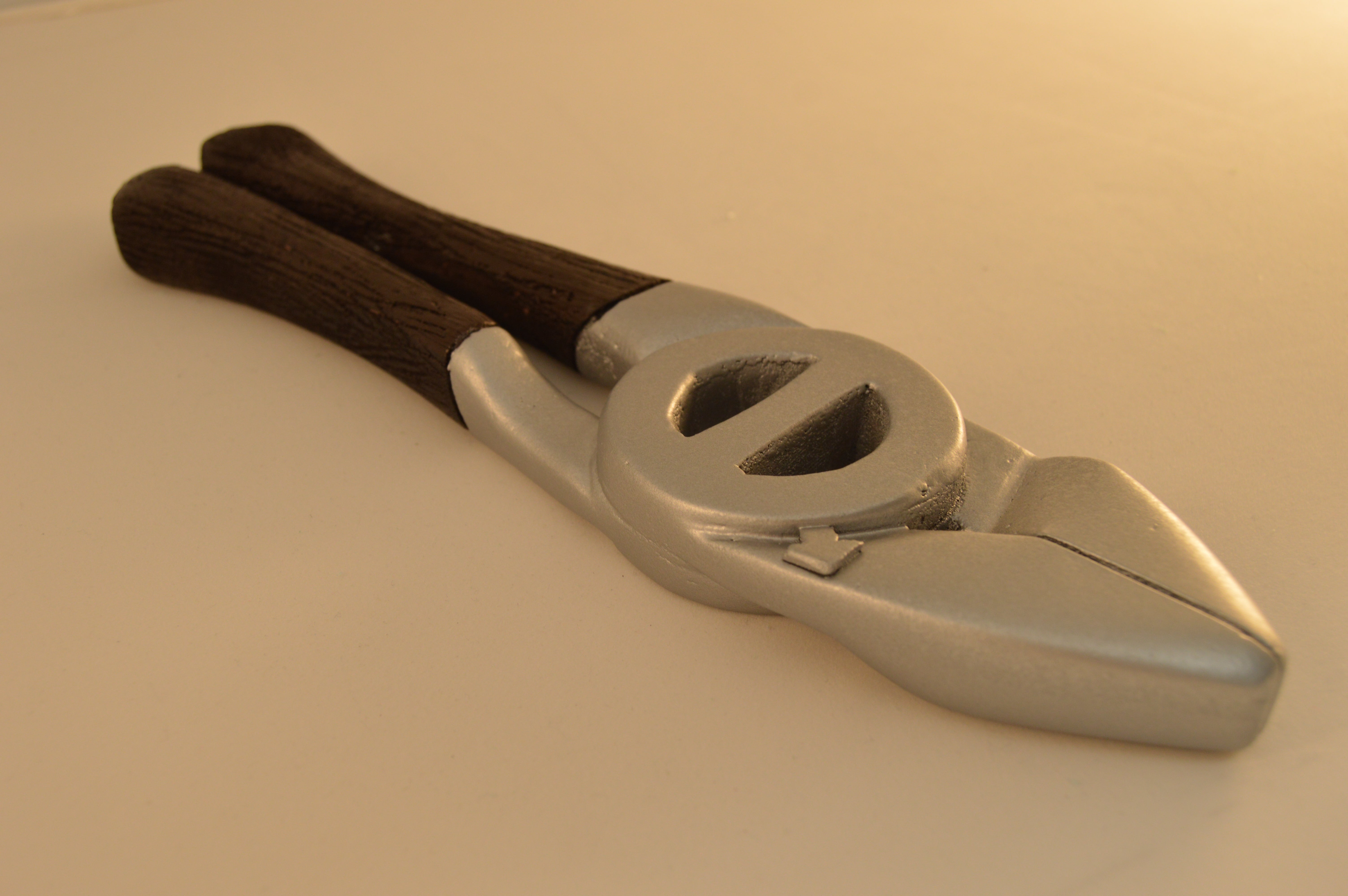
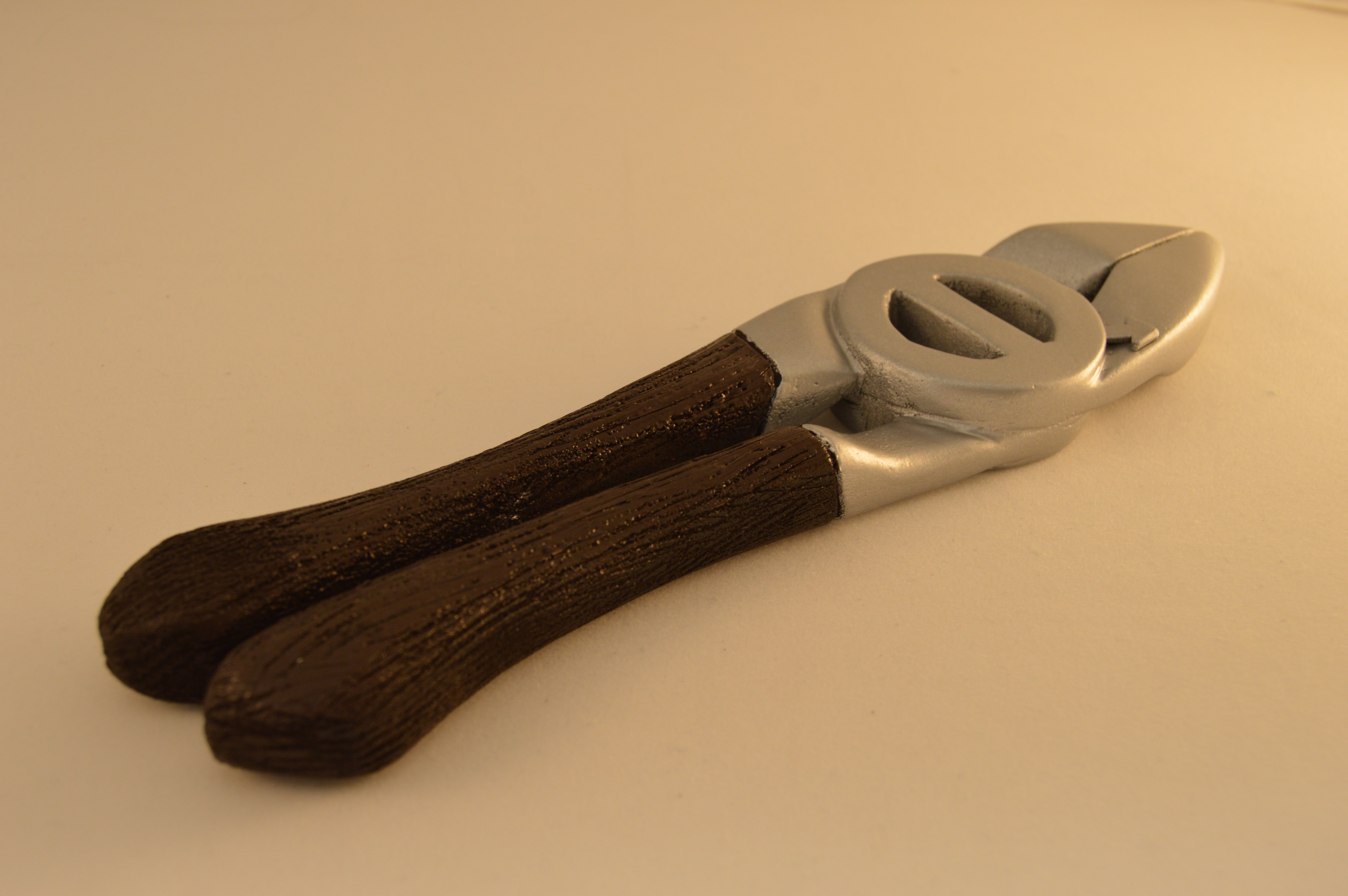
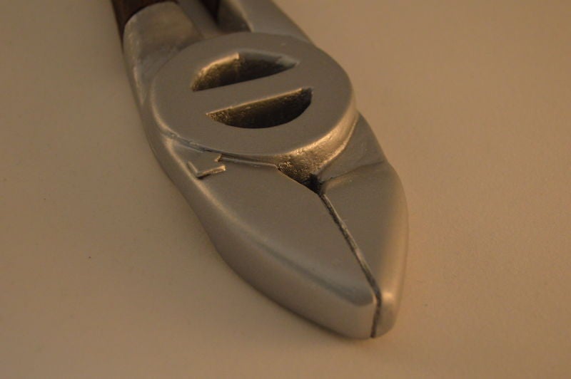
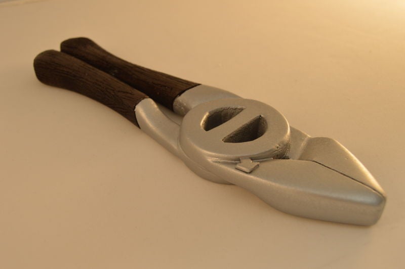
Also that big pliers was just a placeholder until I had the final model completed. This will probably also do a morning repost since I apparently have no concept of time and am only getting to working on this now.
 Bman76 (no it doesn't need a WS6 hood) M. Arch
> Slant6
Bman76 (no it doesn't need a WS6 hood) M. Arch
> Slant6
06/19/2016 at 00:42 |
|
I like these. As for your layout, less is more, and align right is your friend. Good on using complementary colors, however I personally dislike de-saturated colors.

|
Slant6
> Bman76 (no it doesn't need a WS6 hood) M. Arch
06/19/2016 at 00:53 |
|
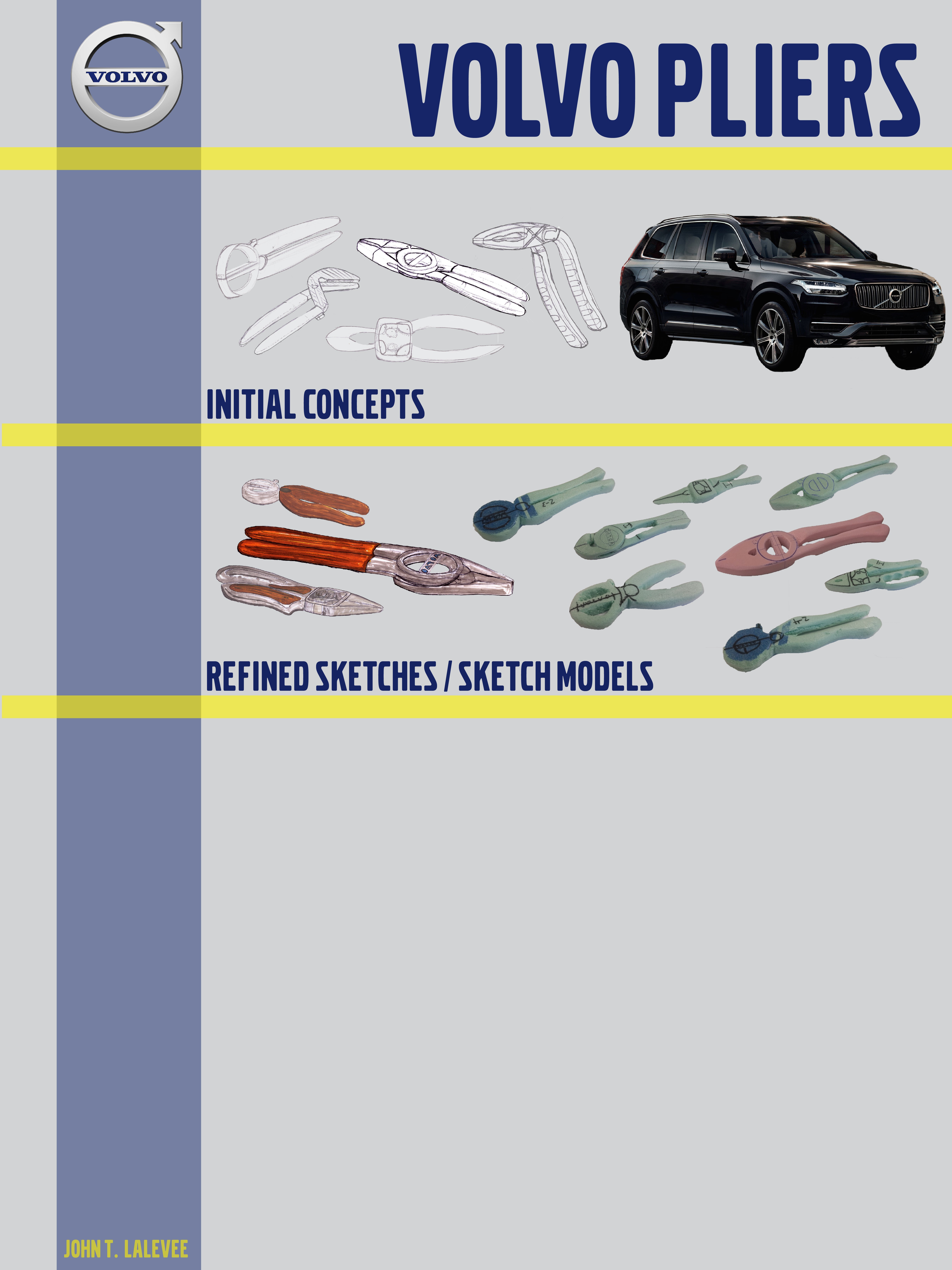
This is an earlier version, feedback from my professor is that I should include more of my sketches and sketch models. Maybe I can make them less opaque like this version.
Thanks!
|
Bman76 (no it doesn't need a WS6 hood) M. Arch
> Slant6
06/19/2016 at 01:11 |
|
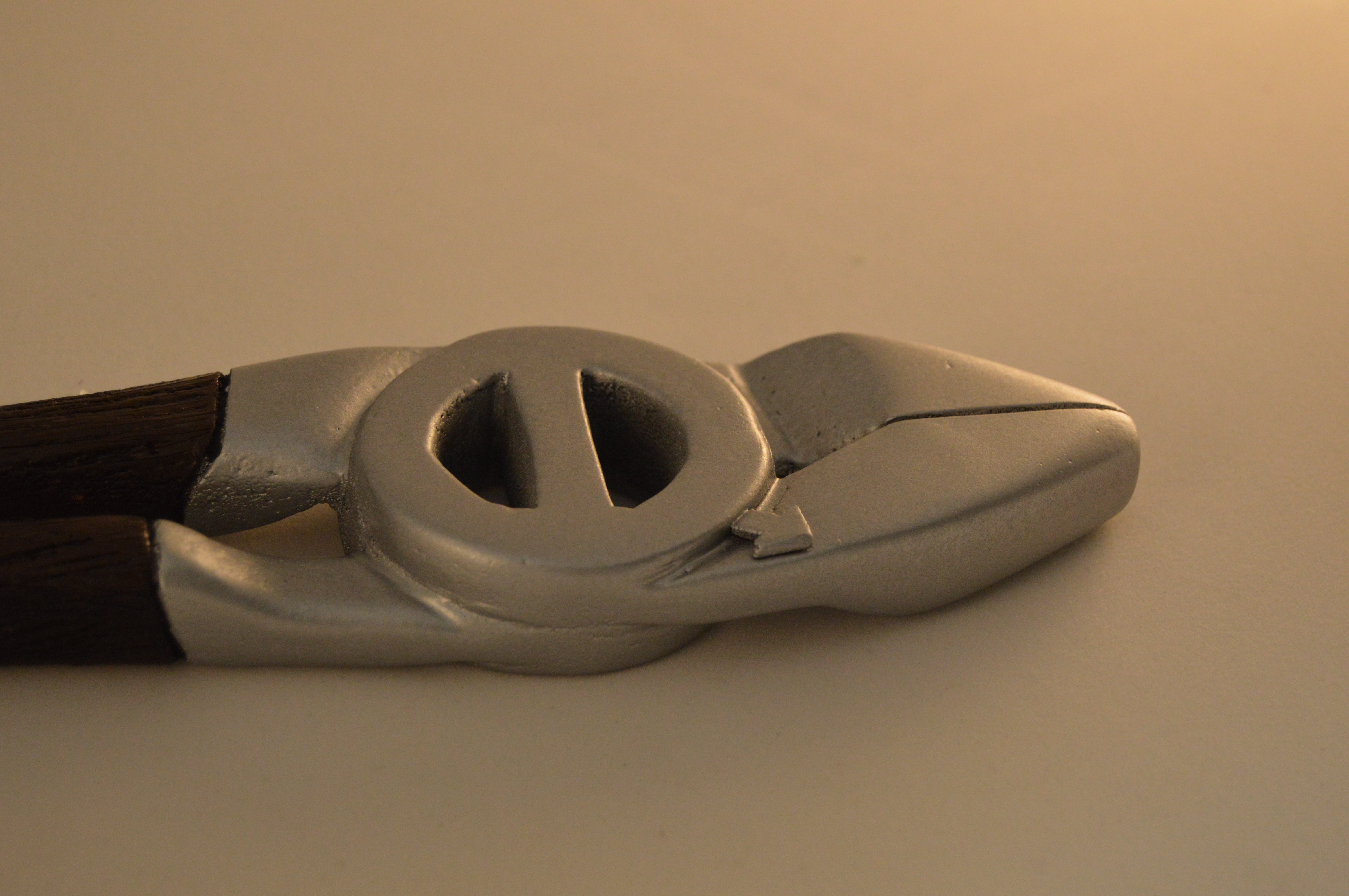
I thing the photos of the cars might be a little jarring interspersed with sketches too. I do like the pliers though, and this stuff takes a while to get the hang of.
|
Slant6
> Bman76 (no it doesn't need a WS6 hood) M. Arch
06/19/2016 at 01:17 |
|
I’m thinking about maybe un-croping the cars and having them with the photos. It might work, maybe a stack of photos on the side.
|
Bman76 (no it doesn't need a WS6 hood) M. Arch
> Slant6
06/19/2016 at 01:21 |
|
Could you find development sketches of the cars and have them co-develop with your design? Just throwing out ideas.
|
Slant6
> Bman76 (no it doesn't need a WS6 hood) M. Arch
06/19/2016 at 01:39 |
|
That’s a good idea. I did base the design more on the interior materials though. Which means I should probably include pictures of the interior.